
Watch the video:
What is the three color rule?
You have three important colors in your frame:
- About 60% of the frame is the predominant or primary color.
- About 30% is a secondary color, and
- the last 10% is an accent color.
Colors are chosen by ‘area taken’ in the scene as a whole, not by importance, and not by just one frame.
It looks something like this:

Why is the three color rule important? You simplify the storytelling process, because color greatly influences mood. The second reason is you can isolate your characters and help the audience focus their attention on your main characters, and not get distracted by the background.
I’ll show you how you can use the three color rule to make your films cinematic.
Three color rule used in Her
Let me use Her as an example, because it’s easy to understand. Here’s a simple frame:

I need to isolate the three main colors. You can use any software that lets you pick colors from an image. There are hundreds out there.
My main goal is to pick the most dominant color. I’m also using the movie as a whole, and I know the most dominant color is a variant of brown. Red is the key secondary color, and from this frame, can you guess the accent color? It’s a kind of blue. The exact shade can be manipulated using color correction later, and some variation is expected due to lighting and cinematography.
Now let’s compare our choices to other frames from the same movie:

You can see how the three color rule simply works in defining a strong mood and color for the film as a whole. Blue is used as an accent color, otherwise it will be monotonous. Red is obviously the most important color for the film, but the most dominant is still brown. It takes up most of the frame, and it allows us to focus on the actors and the secondary color.

How do we pick the primary and secondary colors?
Should the primary and secondary color be of the same family, or complement each other, or should they be opposites?
In Her, the colors complement each other. Both red and brown are earth tones, and don’t fight each other.
But you can easily go the opposite way. Let’s take another landmark movie in color terms, Amelie.
Three color rule used in Amelie
In Amelie, the predominant color is brown-orange.
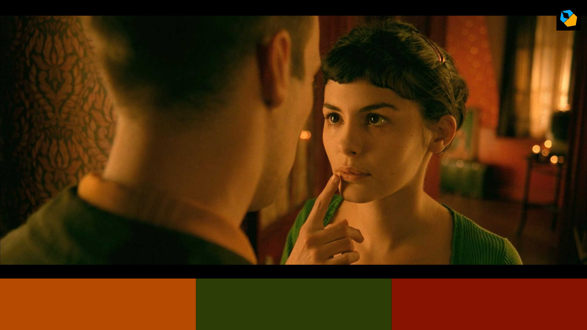
You are free to use different shades of the same hue, darker and lighter and even colors very close to it. Otherwise things will start looking like a cartoon. The secondary color in Amelie is not of the same family, but a totally different green.
Green is prevalent in Amelie, and even skin tones were slightly skewed green to match everything.
Note: Color correction and color theory are not executed mathematically in feature films. A lot of it is personal feeling, so you’ll never get precise results.
The third color in Amelie is red. It’s hard to tell that red is sort of the accent color, but it is used almost as strongly sometimes as green. On the whole though, if you study the movie and all its scenes, red settles into a sort of accent color.
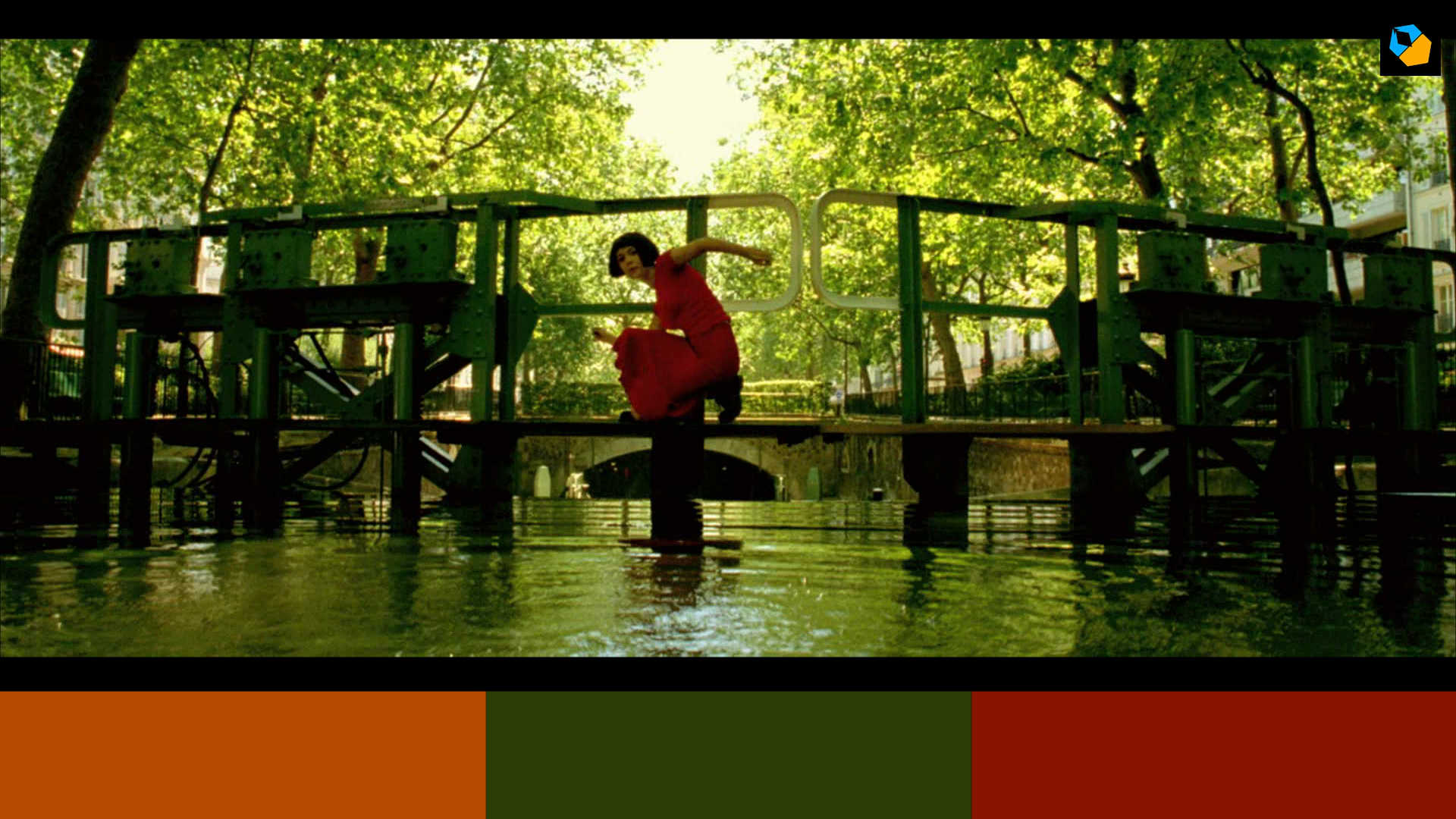
Amelie has another trick up its sleeve. Director Jean Pierre Jeunet also uses a fourth accent color, blue, in some shots. In this scene, green is replaced by blue:

Figuring out which colors are primary and secondary is not always easy. Let’s take Drive.
Three color rule used in Drive
You have three colors in Drive, a predominant blue, a brown, and a tiny red. From this frame you’d think blue is the predominant color:

Don’t just study frames, but study the movie or scene as a whole. A single frame can throw you off.
When you study other shots and scenes, you’ll come to realize brown is the primary color. Blue is the second color, and red is the accent color, as this scene and shot shows quite clearly:

Even in other frames you can see hints of red forming the accent. Most of it is by design, and the rest are taken care of in color correction:

Color is an important psychological tool for filmmaking. Look at the world around us. Most mundane products are almost neutral in their colors. That’s because companies want to sell to the most people, and don’t want color to be deciding factor. Apple iphones are a great example. There’s a good reason why it’s mostly silver, space grey and gold.
When you want creativity and emotion to take center stage, you use colors – you can add color to anything and it instantly becomes a personality.
What are the most common colors used in the Three Color Rule?
Most films pick brown or orange tones as its base or primary color because that’s the color of skin. It doesn’t matter if the skin is white or dark or everything in between. They all basically have the same underlying color, which is represented on a vectorscope. The earth and trees are also brown, so it’s hard to escape brown and its shades.
Then the next three popular colors are the three primary colors – red, green and blue. Just in the examples I’ve shown already you can see how these three colors are popular as the secondary and accent color. They are opposite on the color wheel, and add a lot of complexity to your shots.
How to apply the Three Color Rule in your own films
If you have a boring room, paint the walls beige or some shade of red or whatever.
Find a rug that matches that color.
Maybe the couch can be a secondary color, or just work backwards. You can’t change the color of your couch most times, but you can paint the walls, and you can hide or rent a rug, or just get a cheap rug of the exact color you want.
Then use an accent color for small props, and you’re good to go. All this can be done for cheap and fast. You really can’t ask for a simpler way to make your films cinematic.
The most important thing to take note of is skin color. It should look natural, unless you’re telling a fantasy story like Amelie or The Matrix. When we feel sick our skin becomes ashen or pale, and it has an impact which most audiences are used to. If it’s too ruddy or red that’s a telltale sign of either good health or bad health, depending on your culture. You really don’t have a lot of leeway with the color of skin.
For most cinematographers the color of skin is the first priority.
A couple of weeks ago I made a film about shooting in two colors. It’s basically a version of the three color rule. Check it out:
The primary and secondary colors are neutral colors designed to not draw attention to themselves. Then we have two accent colors, which dominate depending on the scene. It’s your choice, whether to stick to one accent or two, or how you want the secondary to play with the primary.
Using the three color rule for clothes and wardrobe
The three color rule is not just used for the production design or art, but also for clothes. The clothes are easily a part of your color scheme.
The Fall by Tarsem Singh is one of the most beautifully shot movies, ever. Brown is once again the predominant or primary color. Blue is the secondary color, because there’s lots of sky in The Fall. Red is the all important accent color. But there is another accent, green. There’s also yellow. The yellow is not really a pure yellow, but more similar to the brown shade in the movie. The green is not a stark pure green, but a duller green closer to the color of leaves. Still, it is not brown or its family. So The Fall is similar to Amelie, in that it has two accent colors.
Now here’s a cool shot:

Let’s pay special attention to the clothes.
The first character is barely clothed, but whatever he’s wearing fall in the brown family and don’t draw attention to themselves.
Except the green horns. That’s the accent.
Now the second character, who has yellow, which is sort of brown shade or gold, if you want to call it that. His hat is a red accent.
The third character is in black, which is a neutral color. He has yellow and red accents.
The fourth character is in green, but his shield is gold.
The final character is similar to the first one, with only red as the standout color. The rest are neutral, but you can see black is the second accent color.
Why were all these colors chosen? You’ll have to ask Tarsem. But what’s clear is each character has elements of another character, and this is the bond between them. You really can’t separate the color of costumes and wardrobe with set design. Even hair can be given importance, as you see in Eternal Sunshine of the Spotless Mind.
What about black and white?
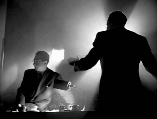
You look at all the great black and white films, and you’ll see three shades. The predominant one is grey. The secondary color is almost always black, because they hardly had blown out highlights so even white in cinema was just light grey, mostly speaking of course. Black is definitely the secondary color, and it gives depth, dimension and shape to everything.
A black and white film’s mood can be heavily influenced by how much white and black pervade the frame. More white and it is high key, more black and it’s low key. You’ll find more information about this here:
All said and done, getting the colors right is the job of the production designer, costume designer and cinematographer. When something isn’t perfect, the colorist can also work wonders, within reasonable limits of course. It’s cheaper to paint a set the color you want, because it has to be painted anyway, rather than spend hours with the colorist fixing something. Good colorists aren’t cheap – so it’s sort of a false economy.
You can ignore all this, and shoot what you get on location, and there’s nothing wrong with that. But in most great films, the director has used color as another tool to tell the story. Nothing random about it.
I hope you found this useful. Let me know in the comments below.
8 replies on “Why Good Looking Movies use the Three Color Rule”
Thanks a lot for this! We didn´t have this in film school which is a shame. Thanks again for your effort.
You’re welcome!
Banging my head against the wall.
Perfecto, que gran razón sobre los 3 colores
Well explained, expecting get into psychologi of colours and how they used in film.
Great exposure
Thanks. Well explained, with clairity and brevity
You’re welcome!