
This article is written for an aspiring filmmaker or screenwriter who wants to write in the correct Hollywood screenplay format for feature films or short films.
What software should you use?
If you already own or can use a professional script-writing application, then the format is already decided for you.
If you’re writing screenplays and making a living from them, I highly recommend Final Draft. It is the industry standard.
Today, I use Fade In Pro, the paid version. They have a free version, but you will have to pay to remove the watermark and publish your script. But at least you can get your script written. I like the interface and you can import Final Draft files.
For a totally free solution, currently there are two options:
- WriterSolo – I’m not too sure about this, but some people seem to love it. I prefer the next option, though.
- Google Docs of MS Word – All you have to do is learn to format the document in a screenplay style. I did this for years before I could afford screenwriting software. Tip: Download the app and ensure you have the files available for offline work.
I prefer software that has a good track record and allows me to save my scripts. I don’t want my work to be in the cloud with a company I don’t know or trust.

Which screenplay format should you follow?
The formatting guidelines I have used for almost two decades is from the Academy Nicholl Fellowships website. They have a sample PDF available to download.
This format is strictly for the U.S alone. If you’re in another country, the formatting (not to mention paper sizes) can change (E.g., there is no standard system in India, to each his own here).
If you need a guideline, use these ideas:
- If you’re sending your script to a competition or service: Follow their guidelines strictly.
- If you’re pitching your script to a studio or agent: Follow their guidelines strictly.
- If you’re writing scripts on spec: Follow the Nicholl system as shown here.
- If you’re writing a screenplay that you’re going to fund and make yourself, who cares about the formatting? Do what you like and works best for your film!
Don’t assume any one system is universal. However, there are good reasons to following a rigid system:
- It allows you to stop worrying about formatting and concentrate on your screenplay.
- It helps others skim through your script faster.
- It forces you to think in terms of scenes, actions, transitions and dialogues.
- It lets you time your screenplay – one page is roughly one minute of screen time, if written in the Hollywood system.
These are good reasons you should stick to one kind of formatting. Otherwise you’ll always be formatting.
I chose to follow the the Nicholl format, and have been using it for over 25 years now.
What paper size do you use?
The page layout starts with the page size. You have two options:
- US Letter – 8.5” x 11” (215.9 mm x 279.4 mm)
- A4 – 8.3″ x 11.7″ (210mm x 297mm)
As you can see, they aren’t very different, but A4 is a bit longer:
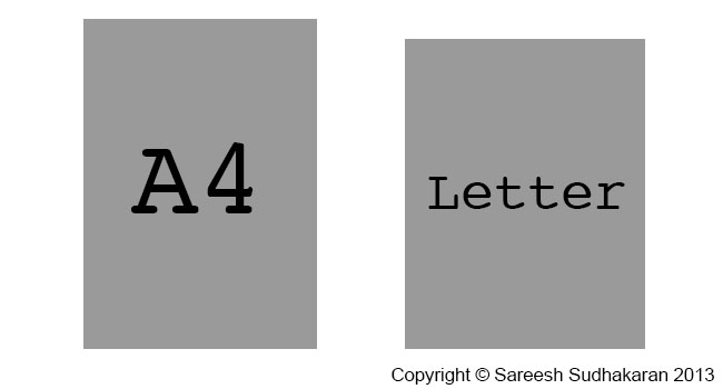
How is A4 different from US Letter?
You might be wondering if there are any practical ramifications of using A4 over the standard US Letter format. If you’re sending a web PDF document, then consider where it will be printed. If it is going to the US, then it will be printed on US Letter.
The screenplay format is designed for US letter, and not for A4. I’ve been using it for A4, since that’s the only kind of paper I can buy in India.
Courier 12-point should give you 4.23mm (0.166″) per line. For A4 paper, this means 55-64 lines , and for US Letter paper, this means a maximum of 51-60 lines. How many characters does that make?
- A4 – Between 3,135 to 3,648 per page.
- Letter – Between 3,060 to 3,600 per page.
That’s an approximate difference of 2% between the two. If one page equals one minute (60 seconds) in US Letter, it would mean 61 seconds on A4. For a 100 page script, it would approximate 100 minutes in US Letter, and 102 minutes in A4.
Bottom line, there is no practical difference. Let’s focus on what matters.
The font for a screenplay
The font is Courier 12-point 10-pitch.
What’s the meaning of point and pitch? Pitch refers to the number of characters per inch horizontally. E.g, one line on A4 can hold 57 characters, while one line on US Letter can hold 60 characters.
Courier is a font in which every character uses the same width.
One point (in font terms) = 0.3528 mm (0.014″). How many lines should you have? As a rule of thumb, 55 lines makes the ‘one page = one minute of screen time” work.
Use the default Courier font on your word processor, and don’t overthink it. Any other font will not make the “one minute per page” formula work.
The three parts of a screenplay format
The formatting of a screenplay can be broken down into three parts:
- The page layout
- The title page
- The elements
The page layout for a screenplay
The first thing you add to your page are the margins:
- Left: 1.5″ (38.1 mm)
- Right: 1.0″ (25.4 mm)
- Top Page Number: 0.5″ (12.7 mm)
- Top: 1.0″ (25.4 mm)
- Bottom: 0.5″ to 1.5″ (12.7 mm to 38.1 mm)
There’s more space to the left because you’ll be binding or filing your screenplay. Otherwise on average there’s a 1 inch border on all sides.
I’m not covering bindings because that varies greatly, not everyone agrees on how it should be done universally, and more importantly, mostly it’s all online nowadays. However, for the sake of completeness, here is what the Nicholl document says:
BRADS — (Acco brand) No. 6 round head fasteners / 1.5 inches. This length works well on most scripts. For a thin script, you might use 1.25 inch brad (#5). You do not want to go longer as 2+ inch brads are universally known as “killers” for their propensity to stab readers and other humans.
…do not permanently or semi-permanently bind your script. Good scripts need to be copied. Bad ones do not.
The title page
Create your title page only after you’ve finished writing your script. Otherwise you might spend months with just the name of your movie!
The title is centered somewhere just above the middle (doesn’t matter). On the next line (or you could leave a couple of lines) you write ‘by’. On the next line write your full name (only first letter is capitalized).
On the bottom right (align to the right), write down your address, phone number and/or email address (Many competitions forbid you to include this information). Nobody’s going to study your title page and gush at your layout skills. It shouldn’t draw attention to itself. If your script is good, then the reader will want to meet you.
No jazzy stuff, bold fonts or styles or colors. The page number shouldn’t be visible on the title page.
Next let’s look at the elements that form a screenplay.
The elements of a screenplay
The elements of a screenplay are as follows:
- Slugs or scene headings
- Main descriptions or actions
- Character names before dialogues
- Parenthetical actions
- Dialogues
- Transitions
- Page breaks
- Titles
Let’s look at them in detail.
Slugs or scene headings
Note: I’m not using the Courier font in the following examples because not all browsers or devices display them correctly.
Every scene starts with a slug or a scene heading. They are always in upper case in the following format:
[INT/EXT].[SPECIFIC LOCATION] – [TIME OF DAY]
E.g., if the scene takes place in an elevator at night, you could write it as INT. HOTEL ELEVATOR – NIGHT. Some like to use a dot instead of a hyphen (INT. HOTEL ELEVATOR. NIGHT), it doesn’t matter.
Sometimes you can have slugs without INT/EXT and time of day. E.g., if you’ve already defined the location as a house, and the character moves from room to room, you could write like this:
INT. JOHN’S HOUSE – DAY
John wakes up and walks into the –
KITCHEN
He sees a ghost, freaks out and runs up the stairs to the –
ROOF
He jumps off, because I’m out of ideas.
You get the idea.
I keep my scene headings as small and compact as possible for better readability. There is no point in getting overly specific because the production might have other plans.
If you want to mention a specific time, like SUNSET or SUNRISE, or DAWN or DUSK, that’s fine too. Usually it’s either NIGHT or DAY, because that’s how lighting setups are estimated.
Main description or action
A main description is either:
- the action that happens in a scene, or
- a description of some human, object or location in the scene.
It is in normal case. There are no rules here, except maybe: The first mention of a character is always in upper case.
I keep my action paragraphs to a minimum, and always less than three lines (I only go to three if I have a strong reason for it).
I use all caps for sound effects and special props or devices.
Character names
Character names are always in upper case. There are three ways in which a character can speak:
- Direct
- Voice Over – you put a (V.O.) next to the name
- Outside Shot – you put a (O.S.) next to the name
A voice over is always used for a narrater, and nobody else. If it’s a character in the story, and they are not in the scene (maybe they’re on a phone or whatever) they get O.S. E.g. –
SAREESH SUDHAKARAN
Wolfcrow delivers the best workflows for filmmakers.
YOU (O.S.)
What a load of bull crap.
MORGAN FREEMAN (V.O.)
(Reading from a script inside a studio)
He’s right, you know.
The formatting is either 4.2″ from the left or centered.
Parenthetical actions
Parenthetical actions follow the character name. It is place either right above the dialogue and sometimes even between lines of dialogue if you want some particular action highlighted.
MORGAN FREEMAN (V.O.)
(Reading from a script inside a studio)
He’s right, you know.
(Scratches his head)
I’m done.
The formatting is 0.5″ to the left from where the character name starts (which is either 4.2″ or centered). And they should be not more than 1.5″ wide.
I keep these to a bare minimum. No point writing in an action for a fictional character when the ‘real’ actor will play it as he or she sees fit anyway.
Dialogues
The formatting is as follows:
- Left: 3″
- Right: roughly 2.5″
I try to avoid spelling mistakes or accents or colloquial speech.
Sometimes the actor can’t pronounce a word correctly, so it must be changed. Sometimes they ad lib, sometimes the director likes to improvise.
No matter what you write in, the actor is the final author of that dialogue.
Transitions
Transitions between scenes are:
- CUT TO:
- DISSOLVE TO:
- FADE IN:
- FADE OUT:
- INTERCUT WITH:
You don’t have to put them in, but sometimes it makes reading easier. The formatting for transitions is aligned to the right on its own line.
I avoid CUT TO because it adds lines and I feel cuts are supposed to be ‘invisible’ anyway. Why draw attention to them?
Can you add your own transitions? I guess so. I remember reading a script by Manoj N. Shyamalan with transition: “SLAM CUT TO:” – I guess you’ll have to watch the movie to find out what that is!
Page breaks
Page breaks happen when you’re in the middle of a long dialogue and you need to carry on to the next page. You add a ‘MORE’ at the end of a page and a ‘CONT’D’ at the beginning of the new page:
CHARACTER NAME
blah blah.
MORE
Next page:
CHARACTER NAME (CONT’D)
More blah blah –
(pausing for effect)
blah.
Formatting is the same as that of character names.
Titles
When you want to superimpose a title, you write ‘TITLE OVER:’ and then the ‘words’ centered on the next line:
TITLE OVER:
Centered on paper, I could appear anywhere on screen.
There is no need for a double line spacing, it’s up to you. The formatting for TITLE OVER is similar to the main action, and the actual words are similar to dialogues.
Some important rules to follow
There are certain rules about screenplay elements. Here are the important ones:
- A slug or scene heading is always followed by action or description.
- The end of a transition is always a slug or scene heading.
- Dialogue is assumed after each character’s name, unless a parenthetical action is necessary. After every parenthetical there is always a dialogue.
There you have it, the basics of a screenplay format. Happy writing!