
In 1990, Pretty Woman hit theaters and became a massive success, raking in nearly half a billion dollars. But here’s the real question: how does a movie made almost 35 years ago still look this slick, glamorous, and timeless?
Let’s break down exactly what makes it so visually enduring.
Watch the video:

Lighting and Glamor
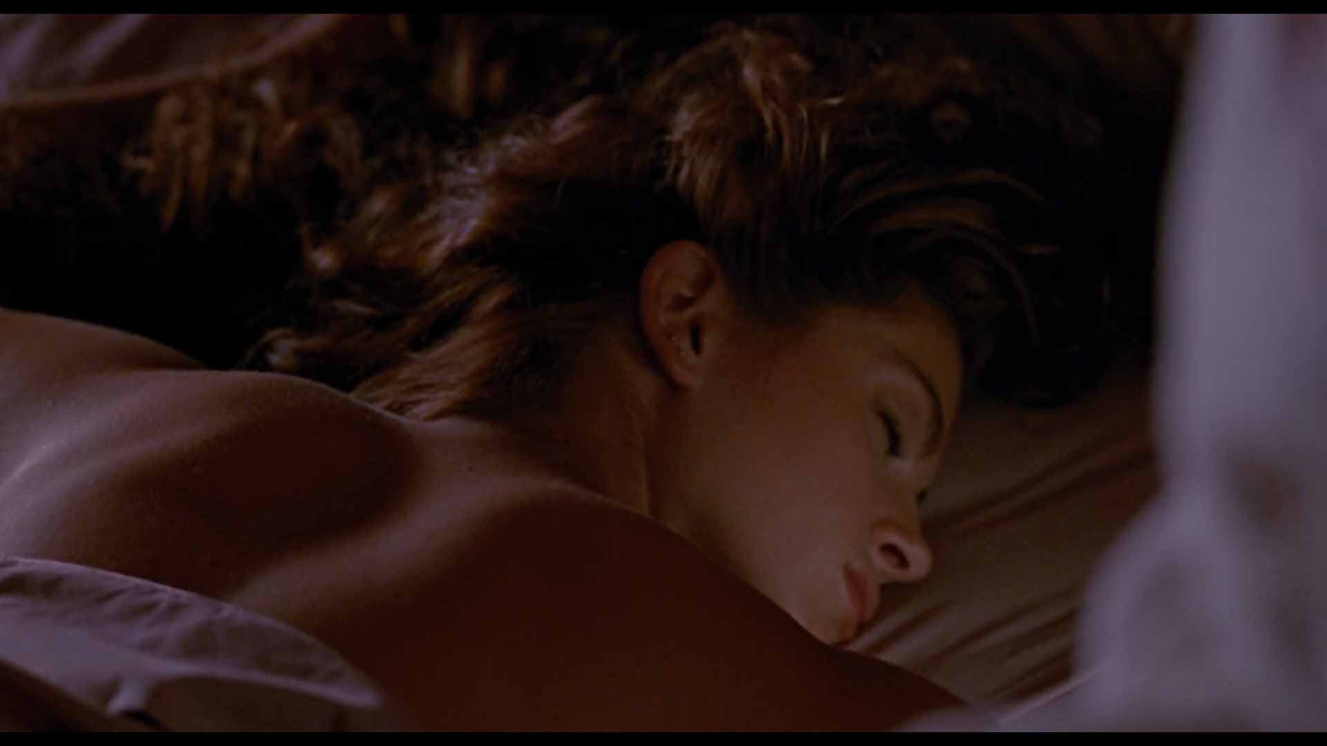
Cinematographer Charles Minsky gave Pretty Woman a warm, soft glow that makes everything look like a dream—or at least a very expensive spa. This kind of lighting makes the characters and their world feel polished and a little unreal. Even when we first meet Vivian in her chaotic surroundings, the lighting doesn’t feel too gritty or dark. It’s a fairy-tale glow from the start, hinting at the transformation to come.
Minsky’s use of soft lighting removes hard shadows, smoothing out imperfections and making every character look their best. This is classic glamour lighting—straight on or from a slight angle, creating a gentle triangle of shadow under one eye (a technique called Rembrandt lighting). It makes everyone on screen look stunning without being over-the-top.
The penthouse scenes take this to another level. The lighting here is intimate and cozy but still luxurious, balancing between “lived-in” and “polished.”
It’s a tricky thing to pull off – too much light, and it looks like a furniture showroom; too little, and you lose that sense of wealth. But Pretty Woman controls it perfectly, keeping everything refined without sacrificing warmth.
Color Palette
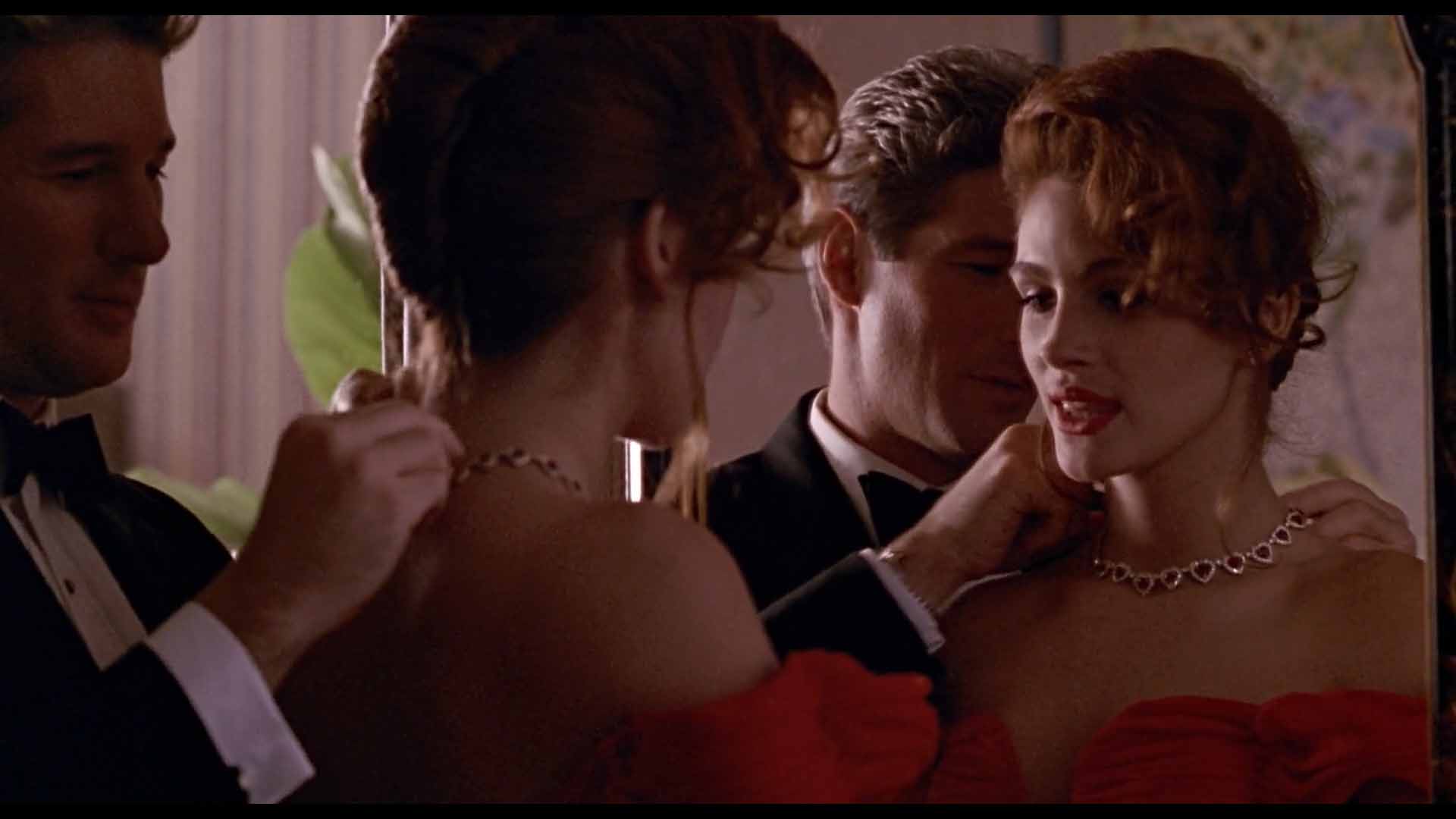
The film’s color scheme plays a significant role in setting the tone. At first glance, you might think red dominates the movie—after all, Vivian’s red dress at the opera is one of its most iconic images. But the movie is actually working with two contrasting color palettes: the world of business and the world of romance.
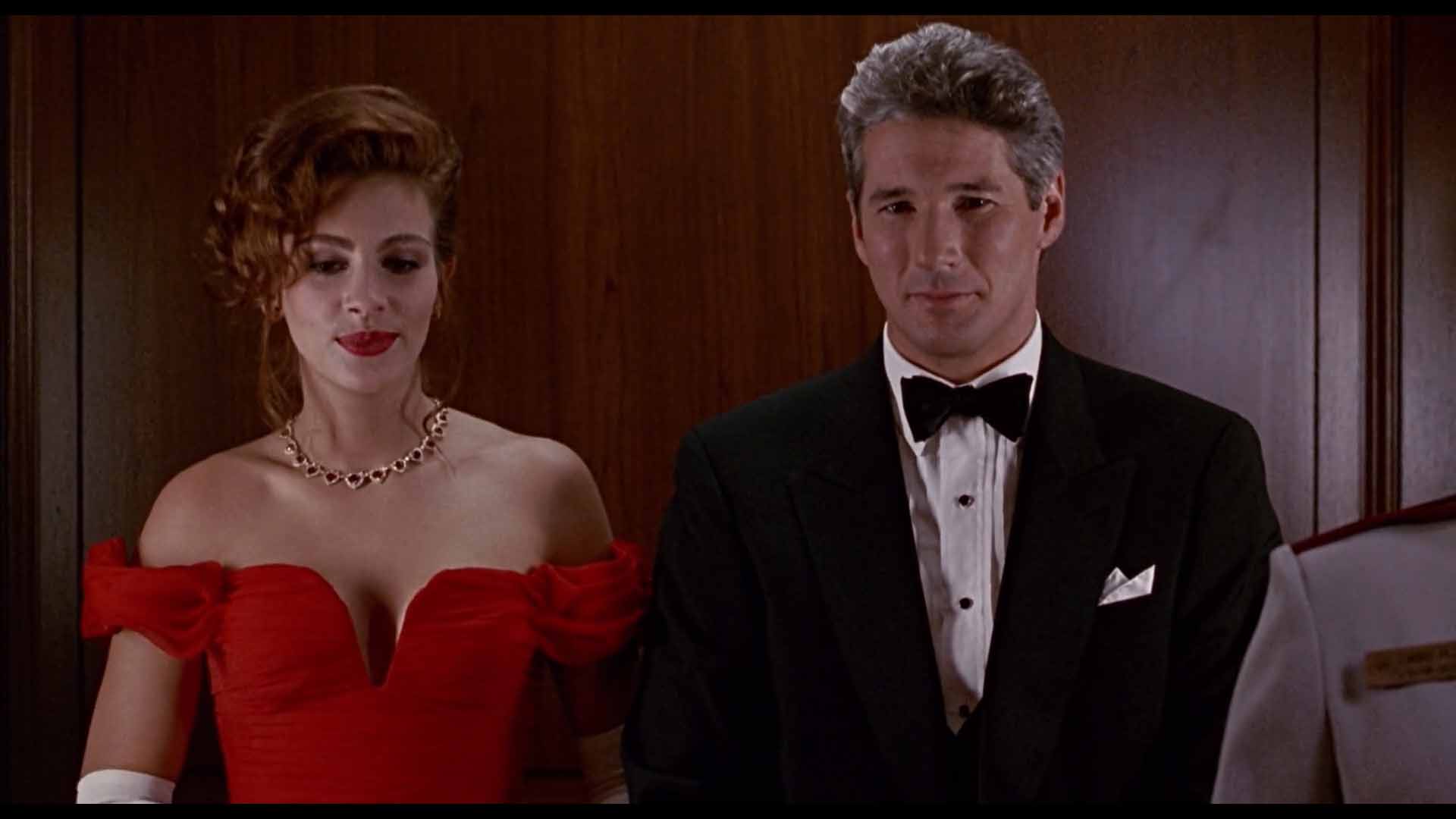
Edward’s world is filled with neutral tones—blacks, browns, and grays. Offices, business meetings, and even his wardrobe follow this subdued palette, highlighting the controlled, emotionless nature of his life.
The other part of the world bursts onto the scene with vibrant primary colors – red, blue, yellow and green:
Vivian’s red hair, bright outfits, and, later, her iconic red gown. These colors symbolize her spirit and individuality, standing in stark contrast to Edward’s neutral, restrained world.
As the story progresses, the color palette reflects Vivian’s transformation.
Early on, she wears a mix of colors, blending into the chaotic world around her. But as she steps into Edward’s world, her wardrobe becomes more refined, with red becoming the defining color.
Even the penthouse, where their romance blossoms, is bathed in shades of pink and soft whites, reinforcing the romantic fairy-tale vibe.
The Role of Locations
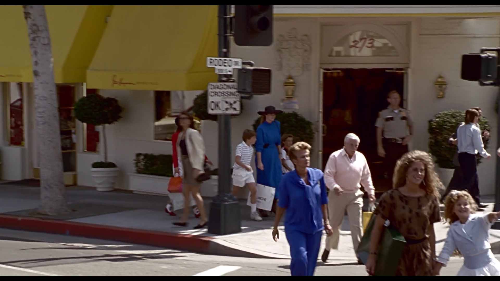
Beverly Hills and Rodeo Drive are more than just settings, they’re characters in the film.
Rodeo Drive is presented as a place of transformation and aspiration, a world where you can buy your way into happiness. The movie makes these locations look so clean and shiny, you half expect them to hand you a gold-plated mop if you drop something on the sidewalk.
The camera glides smoothly through boutiques, capturing every detail of the clothes and accessories, making you believe that a good shopping spree can solve anything.
Even the Lotus sports car Edward drives adds to the film’s sleek, aspirational look.
Costume Design
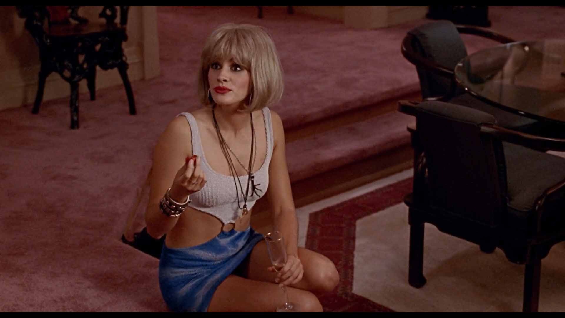
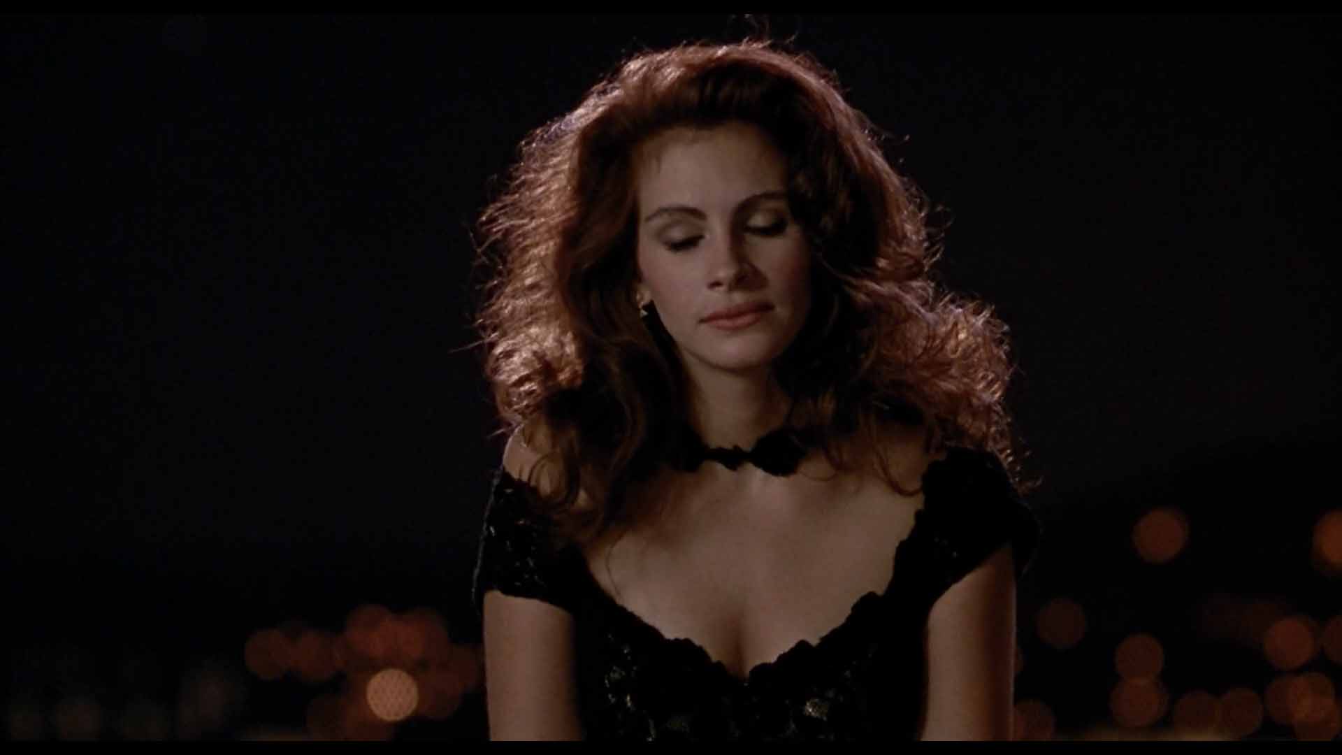
Vivian’s wardrobe changes are more than just a plot device—they’re a visual representation of her journey. Early on, she wears chaotic, mismatched outfits that reflect her uncertain place in the world.
But as her relationship with Edward deepens, her style becomes more refined. By the time she steps out in that red gown for the opera, it’s clear she’s found herself.
This transformation isn’t just about appearances, it’s about self-expression. The clothes and colors Vivian chooses reflect her inner growth, and Edward falls for the person she becomes, not just the way she looks.
Even today, the outfits still hold up.
Camera Movement and Framing
The film’s camera work reflects Vivian’s transformation, too. Early scenes are shot with wider angles and more handheld movement, capturing the chaotic energy of Vivian’s life. But as she becomes more comfortable in Edward’s world, the camera movements become smoother and more fluid, mirroring her newfound confidence.
In the quieter moments, like when Edward and Vivian are just hanging out in the penthouse, the shots get tighter and more intimate. The focus shifts from the external world to their relationship, drawing us into their private bubble.
The choice of neutral to telephoto lenses ensures that even in night scenes, everything stays visually glamorous.
The visuals are aspirational but grounded just enough to be believable.
The Power of Casting and Chemistry
A lot of the film’s magic comes down to the chemistry between Julia Roberts and Richard Gere. Roberts could probably charm her way through a brick wall, and the camera knows it.
It lingers on her smile, her expressions, and her movements, capturing every ounce of her charisma. Gere, with his calm and cool demeanor, plays the perfect counterpart.
Pretty Woman set the standard for modern romantic comedies, and many films have tried to replicate its vibe. But few have nailed it. The combination of elegant visuals, thoughtful camera work, and subtle lighting makes it stand out, even after all these years.
Vivian’s transformation still feels exciting, and Rodeo Drive still looks like the place where dreams are made—or shattered.
In the end, Pretty Woman isn’t just about romance, it’s a visual fantasy wrapped in luxury and charm.
The lighting, colors, wardrobe, and camera work all tell a story of transformation and self-discovery. Even today, the film feels fresh and magical, just as it did in 1990. It’s not just a rom-com, it’s a visual delight that keeps on giving.
And that is why Pretty Woman still looks like a billion bucks. Let me know what you think in the comments below.