
Most filmmakers forget about color.
Color is one of the most powerful parts of filmmaking. It can guide the audience’s emotions, tell you what a character feels, and shape the world of the movie.
In this article, we’ll look at the most common color palettes used in cinema. Each one has its own emotional effect. Each one is easy to understand.
And, you can use them in your own work. Let’s start with the most basic look.

Black and white
Before color film existed, movies were black and white. But even today, some filmmakers choose it on purpose. Why? Because black and white removes the distraction of color. It brings focus to faces, shapes, light, and shadow.
It helps you pay attention to what matters. Look at this comparison, from my own short, Palindrome:

What you’ll notice is: Your eyes are drawn to different things first. But it’s the exact same shot. My eye goes to her facial emotions in the black and white image, but it goes to her eyes in the color image.
Secondly, the background in the black and white image is almost invisible from an emotional standpoint. But the blue background in the colored image tells an immediate story.
You might experience it differently. But there is a difference.
Think of Schindler’s List:
It looks serious and stark. The story is heavy, and the lack of color adds weight.
Black and white can feel timeless, sad, or thoughtful. It forces you to look at things that are otherwise distracting with color.

It’s also a smart choice when your lighting or production design isn’t perfect, because black and white hides color mistakes!
Monochrome
A step beyond black and white is the monochrome palette. Monochrome means “single color”. The image looks tinted with a single color, like this:
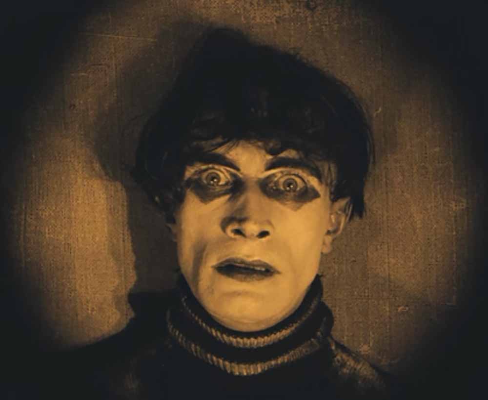
Why would you want your movie to be in just one color?
In the silent era, Sepia was used for day scenes. Teal or blue for night. It gave mood and clarity before sound or color film existed. Modern films don’t tint the whole frame like this, but they use the same idea to create a monochrome-like palette:
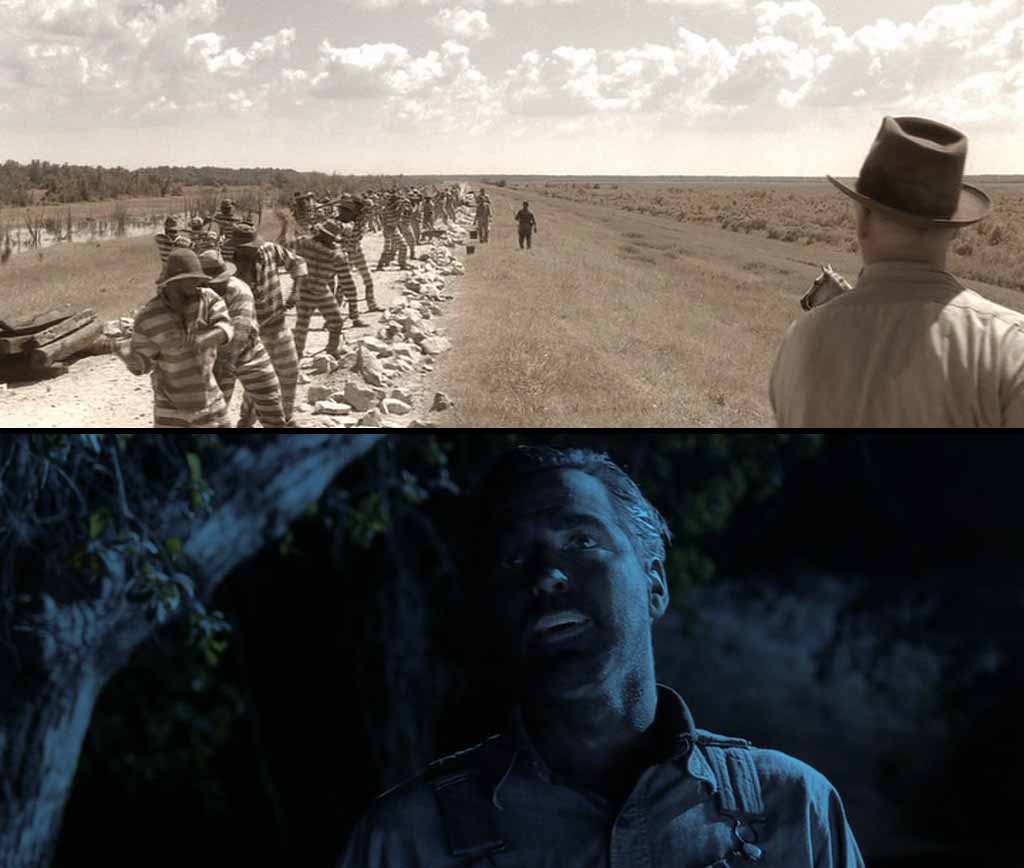
O Brother, Where Art Thou? was digitally tinted with a predominantly sepia tone. It gives the film a dusty, sun-baked, old-world look. They also used other colors selectively, and the combined effect is of monochrome, but not tinted.
The Matrix uses green when we’re in the Matrix. Even in the film version (before they added green for the digital releases) the filmmakers went to a lot of trouble to inject green into these scenes.
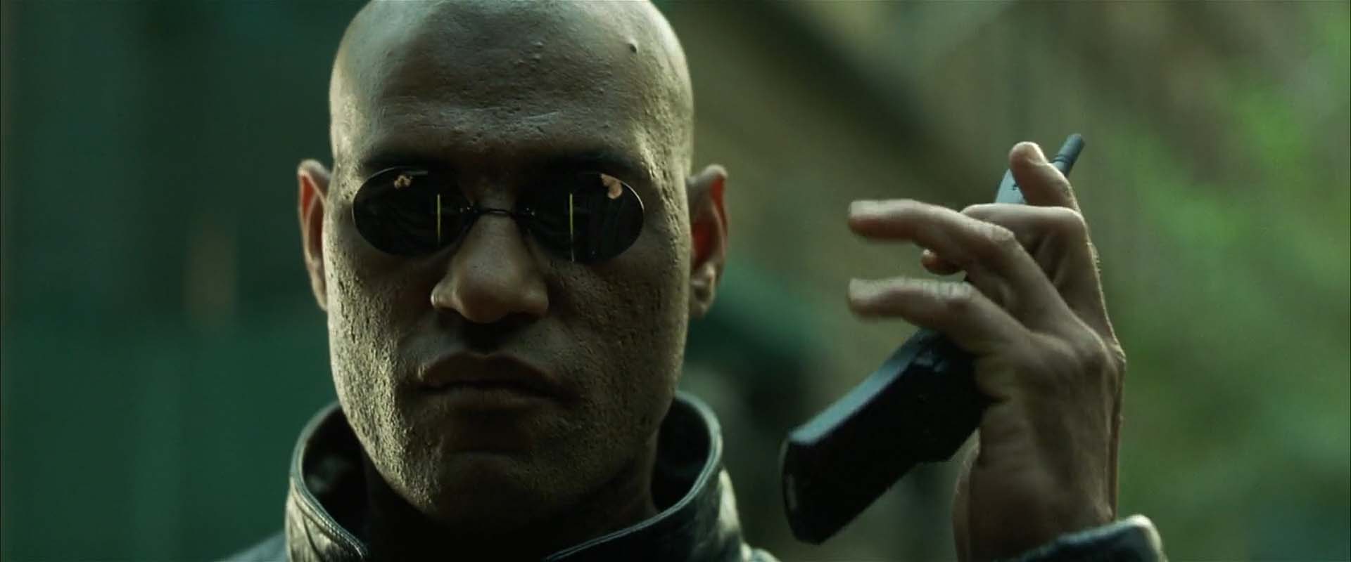
The green color makes the world feel fake and coded, like a digital prison.
You don’t have to stick to sepia, teal or whatever. The colors can have any impact you want it to have.
Duotone
What’s next from monochrome? Duotone – where two colors dominate. The Matrix Reloaded uses this:

Green and red are a powerful combination used in many films like Amelie and The Double Life of Veronique. Here’s a video that shows how it was used:
Using one or two dominant colors can give your film a strong emotional tone. Monochrome keeps the world simple but not lifeless. Duotone can make a low-budget scene feel stylized and purposeful.
What’s the most popular dutone look?
Teal and Orange
This has taken a back seat over the years, but it’s still a strong palette:

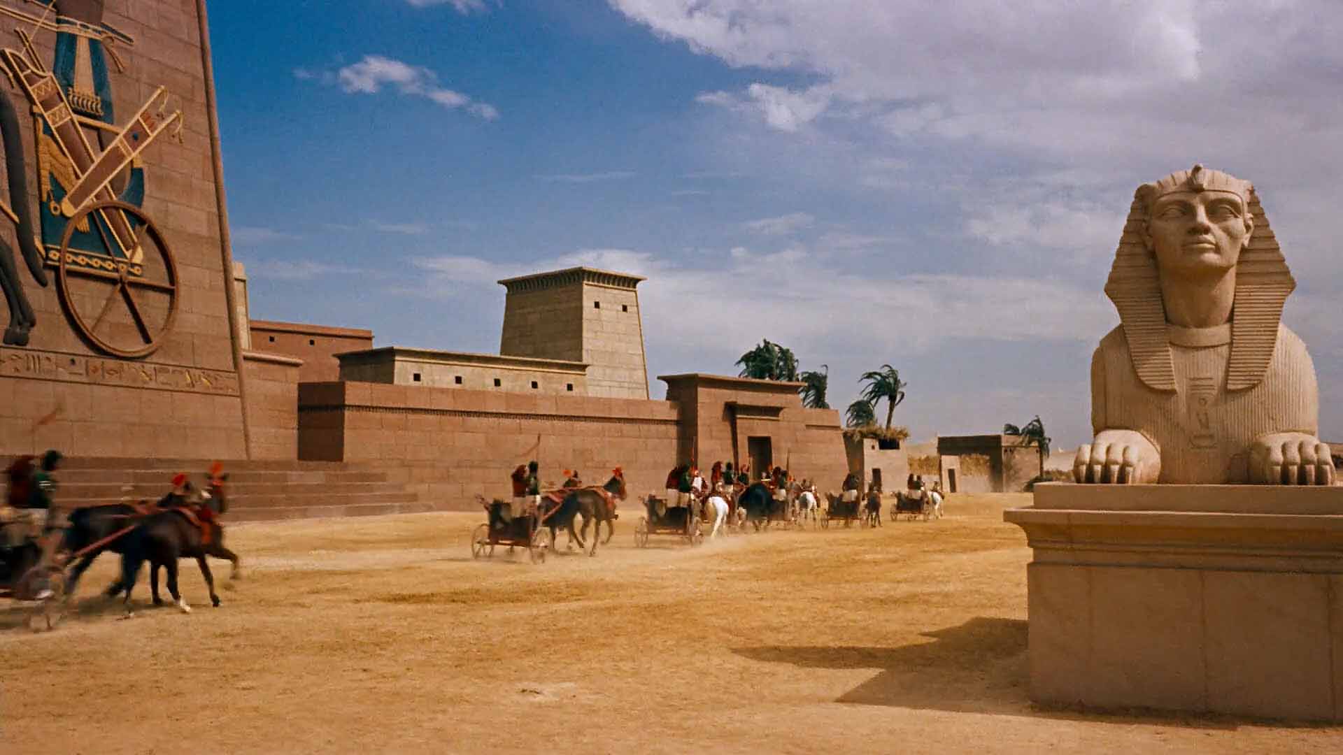
Mad Max: Fury Road is an example of duotone, but instead of green and red, it uses orange and blue. The sand and sun are orange, the shadows and night are blue. These two colors are opposites on the color wheel, so they pop. They give the film a larger-than-life look.
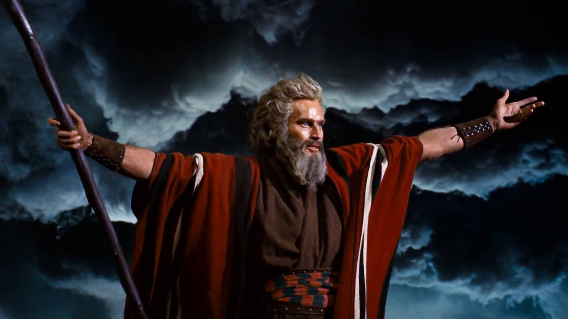
Orange is close to skin tones, and it conrtasts well with blue. Even when skin isn’t orange, it is forced sometimes:

Notice how everything in the background is blue – either through production design or the selective use of color grading.
This isn’t a new thing. It’s been around since color film:
The orange and teal look doesn’t lend itself to a particular emotion, maybe because it is closely aligned to nature – but just pushed a bit more. It definitely helps pull out lighter skin tones from its opposing color. With darker skin tones, the effect is not that impressive – especially when you under or overexpose the image:

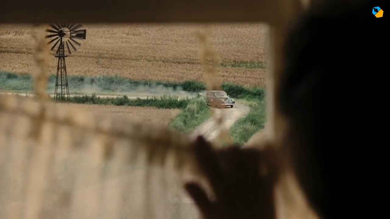
Natural and warm
When you have no clue about what colors to use, go for a natural look, just warmer.
Think of golden hour lighting, wood tones, candles, and sunlit rooms. These colors feel cozy, human, soft. They are used when the story is about love, family, or nature. Anything positive:
The natural palette make the film feel real. Not stylized or flashy, safe. If you want the audience to relax and feel close to your characters, this palette works everytime.
You could also push the white balance the other way.
Cool and sterile
Cold palettes use blue, green, gray, and white. These colors make the world feel harsh, empty, or sad.
The Girl with the Dragon Tattoo pushes cooler tones even more. Walls are blue-gray. Even skin looks pale:
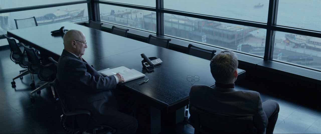
This color palette creates distance. It says the world is cruel, the characters are alone, the truth is hidden. It works well for crime, horror, and drama. It’s overused a lot in most streaming shows.
Use cool palettes when you want to show control, fear, or systems that crush people.
Muted or Pastel colors
Muted colors look washed out or faded:
Muted palettes are used when you want to feel quiet, nostalgic, or soft.
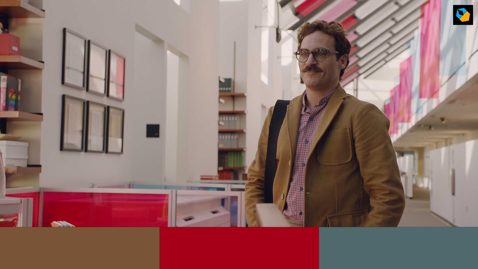
Her is set in the future, but it doesn’t look “futuristic”. It looks warm, dreamy, and something that could happen in a few years (and it has!). The colors are like pastels. Reds and pinks dominate, but they’re not loud. They feel gentle.
The pastel color palette works with lonely, tender stories.
Muted palettes are useful when you don’t want the colors to take over the story.
They sit in the background and support the tone. They are also forgiving in bad weather or low light.
High contrast color blocks
Some films go all-in on color. They use bold, opposite colors right next to each other. This is the most graphic, visual style.

You could give meanings to colors, watch this to see how Life of Pi did it:
A cinematographer with strong views on color is Vittorio Storaro:
These palettes help create a world that’s full of style – and you can go in any direction you want.
But you have to be careful. Too much color can be loud or messy. As long as it is done in a calculated way, with taste, it will work.
Color in the Dark
Night or darkness doesn’t mean no color. In fact, some of the most beautiful color palettes can come out at night.

It’s fascinating how you can use color at night – like how Martin Scorsese used the colors of traffic lights for Taxi Driver:
Another film that uses color well with loads of darkness is Tron: Legacy:

Or look at how the original Tron did it:

The trick is to let the darkness do most of the work, and let color be the accent.
How to pick a color palette for your film
Start with the emotion. What do you want the audience to feel? Then look at your setting. What colors are already there? What can you add or take away?
If you’re on a low budget don’t try to use every color. Pick two or three that work well together. Use the 60-30-10 rule:
Always test your palette before you shoot. Take photos and see how much control you really have. Not everything can be fixed in color grading.
Color is not just decoration. You need taste, control, and purpose. So let your story lead the way. Color will follow.
Sir, I watched your movie, “A Count Of Ten”. More as a “thank you,” for your great newsletter than anything else. I’m so glad I did! I normally dislike subtitles, but the movie was so engaging, and the script was so tight, I found myself captivated. Well done!
Even though I am a hobbyist (I’m 70), I really have learned a lot. If I do nothing more than create more interesting travel blogs, I’ll be happy.
I wish you all the best and please keep doing what you do!
Steve Brown, USA
Thank you for watching, Steve. And thank you for the kind words!