
You might assume Back to the Future was a guaranteed success from day one. However, the reality of its production tells a different story.
The script faced rejection over forty times. Major studios passed on it repeatedly. Disney rejected it because the storyline involving a mother falling in love with her son was too risky for their brand. Other studios rejected it because they felt it was too soft compared to the raunchy comedies popular at the time.
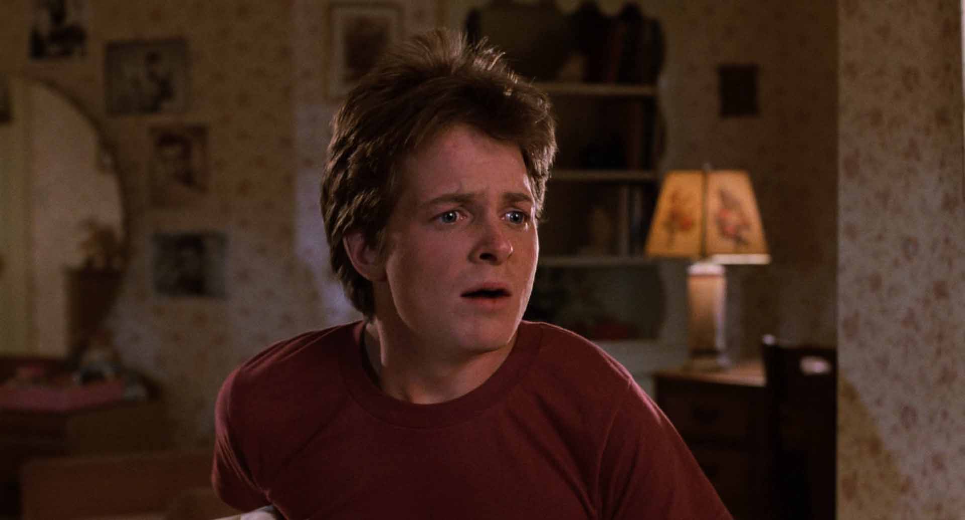
The production team spent millions of dollars filming the movie with Eric Stoltz in the lead role. They realized six weeks into shooting that it was not working. The tone was too serious. The comedy did not land. A modern studio might have released the inferior version to save money. Universal Pictures and director Robert Zemeckis chose a different path.
They fired their lead actor. They scrapped the footage. They started over with Michael J. Fox.
This decision cost millions of dollars, but it proved that the studio prioritized quality over budget protection. This commitment to the final product is visible in every frame. The film looks like a billion bucks because the creators refused to settle for mediocrity.
Watch the video:

The Cinematography of Dean Cundey
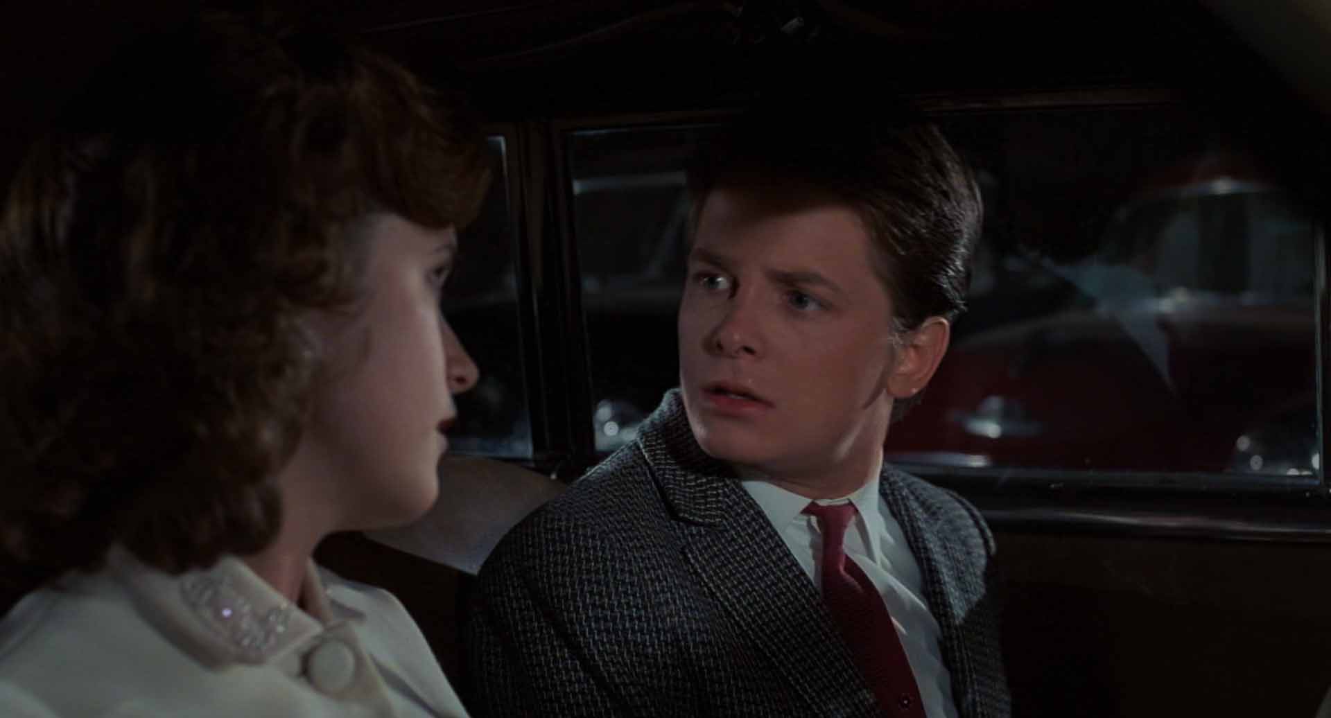
Director of photography Dean Cundey brought a specific sensibility to this science fiction comedy. He understood how to use shadow and darkness to create depth. Many comedies use flat lighting to ensure every joke is visible.
He shot the film on 35mm stock. He utilized the standard 1.85:1 aspect ratio. This choice allowed for vertical height in the frame. This was crucial for shots involving the clock tower and the town square.
Cundey used a technique of underexposing the film negative. This crushed the black areas of the image. It made the shadows rich and deep. The style reminds you of a comic book aesthetic.
Modern digital cameras have high light sensitivity. They can see into the shadows easily. Filmmakers often light scenes evenly and grade them later. This results in a flat image. Cundey had to blast light into the scene to get an exposure on the slow film stock of the 1980s.
He controlled where that light went with precision. It makes the world feel dangerous and exciting. To know more about the cinematography style of Dean Cundey, watch this video:
The Challenge of the DeLorean
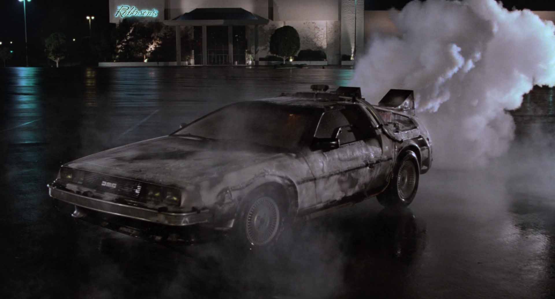
The DeLorean time machine is the most iconic prop in film history. It is also a cinematographer’s nightmare. The car has a brushed stainless steel body. It acts like a mirror. If you place a light anywhere near it, the car reflects the light source and the crew. This creates a massive problem for lighting a night scene.
Dean Cundey solved this by placing lights on the ground. He hid them behind objects or in ditches. The light would streak across the side of the car without flaring the lens. This technique gave the car its signature look. It always seems to be glowing or reflecting the environment. The limitation of the material forced the crew to be creative. The car looks integrated into the world because it is reflecting the world.
The vehicle itself is not a sleek spaceship. It is a modified sports car. It looks industrial. It has wires and vents and thrusters bolted onto the back.
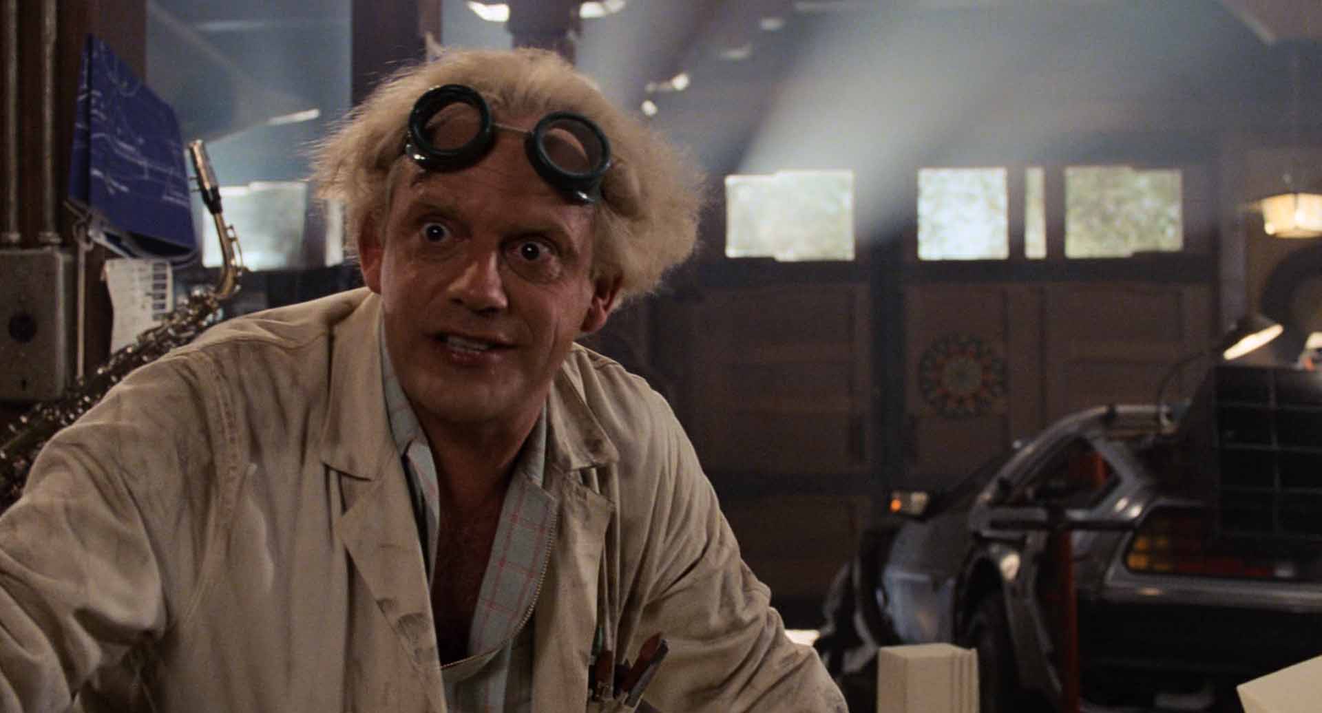
The design follows the logic of the character who built it. Doc Brown is an eccentric inventor. He builds things in his garage. The car looks like it was built in a garage. This attention to detail sells the reality of the machine. It shakes when it moves. The doors hiss when they open.
Practical Effects and Optical Illusions
The special effects in Back to the Future have aged well because they are largely practical.
Consider the fire trails left by the time machine. The crew poured gasoline on the street in the shape of tire tracks. They ignited the gasoline. The fire you see is real fire. The light from the fire hits the objects around it. A computer simulation often struggles to render the chaotic nature of fire correctly.
The ice on the car after it travels through time is another practical effect. The crew used liquid nitrogen to freeze the vehicle. The actors are reacting to actual cold temperatures.
The flying scenes at the end of the film utilized detailed miniatures. The crew built a scale model of the car and the town. They filmed these models against a blue screen. They used an optical printer to composite the layers together. This process creates a slight degradation in the image quality. It adds a layer of grain. This imperfection helps glue the elements together. It prevents the image from looking too sterile.
Our eye accepts the illusion because it shares the same texture as the rest of the film.
The Art of Production Design
The town of Hill Valley is a character in the movie. The production team used the Universal Studios backlot to create the town square. They had to dress the set for two different time periods.
They created a clean and vibrant version for 1955. They created a dirty and run down version for 1985.
The level of detail is staggering. The storefronts are fully dressed. The extras are wearing period-accurate clothing. The cars on the street are authentic vintage vehicles. The production design uses deep focus. You can see clearly into the background. Director Robert Zemeckis wants you to see the world.
The movie theater in 1955 plays a Ronald Reagan film. The same theater in 1985 plays an adult film. The grassy park in 1955 is a parking lot in 1985. These details tell the story of the town’s decline without a single line of dialogue. This is high-budget filmmaking. The money is on the screen.
The film spans thirty years. The actors play their characters at different ages. The makeup team had to age the actors convincingly. This is a difficult task. Bad aging makeup can ruin a movie. It can look like rubber masks.
The makeup artists on this film used subtle prosthetics and paint. They changed the hair and the skin tone. They altered the posture of the actors. Lea Thompson plays Lorraine at age 17 and age 47. Her transformation is remarkable. She changes her voice and her body language. The makeup supports her performance.
The Sonic Landscape
The sound designers created a unique library of noises for the time machine. The sound of the car is a composite. They mixed the sound of a jet engine with the sound of a Porsche 928. This created a futuristic whine that also sounded mechanical.
The sound of the gull-wing doors opening is iconic. It is a hiss followed by a clunk. It sounds heavy. It sounds expensive. If the door made a plastic click, the audience would not respect the machine.
The score by Alan Silvestri is orchestral and grand. It is a large symphonic score. It provides emotional cues for the audience. It makes the small town setting feel epic. The music swells when the car accelerates. It creates a sense of momentum and adventure. A synthesizer score might have dated the film. An orchestra is timeless. Tons of Hollywood films still stick to orchestral pieces for this very reason. Also sounds great in theaters!
The Editing and Pacing
The film is a masterclass in screenwriting and editing. Every line of dialogue sets up a later payoff. The editing is tight. There is no wasted time. The film moves with a propulsive energy.
The climax at the clock tower is a perfect example of editing. The scene creates tension through cross-cutting. We see Doc Brown struggling with the cable. We see Marty struggling to start the car. We see the storm approaching. The editors cut between these elements to build suspense.
The Cultural Impact and Legacy
Back to the Future remains relevant because it captures a universal truth. We all wonder what our parents were like before they had us. We all wonder if we could change our own destiny. The film explores these themes with heart and humor.
The film looks like a billion bucks because of the human effort involved. You can see the craftsmanship and the imperfections are part of the appeal.
The film does not just look expensive. It looks valuable. Let me know what you think in the comments below.