
Seriously, what is the deal with using two colors? Why has it become the norm this decade?
Let’s take a look:

You’ve seen hundreds of films, but probably never noticed how many of them have precisely two dominant colors in most scenes.
There is a reason why these colors are chosen. Obviously it’s not an accident. There is a color story going on as well.
A lot of these color decisions are made on the drawing board, and set design plays a huge role.
But let’s answer one fundamental question.
Why do movies pick two colors? Why not three, or four dominant colors?
Movies have been made with normal colors, and still are. It’s not like a rule or anything that you have to use two colors, or any color palette.
However, the color palette does allow you to do one super creative thing, and that is tell a story through color. Which aspect of filmmaking does color impact the most? For me, it’s the mood.
We all know different colors influence different moods. Too many psychological studies have been published about this, none of which I’m going to reference here.
Professional products like cameras, laptops, machines and business suits are made in neutral colors. But when you want individuality and emotion to shine, you use, you know, colors – like cars, party clothes, fun cameras and face paint.
The traditional way of thinking is red is anger, creates tension. Blue and green are soothing, yellow is vibrant, like life, brown is earthy, neutral. Look around you, the colors of nature – earth, sky, trees and plants are soothing and natural to us. Everything else is more exciting, maybe because they were rare. Painters in the olden days had to go to great pains to create different pigments for their paintings. Today we take these things for granted.
Here’s a cool video I made on the art of color grading:
Of all the colors humans are sensitive to, no color comes close to the color of skin. If you shoot landscapes with cheaper cameras, it’s very hard to tell if it was shot on a cinema camera or not. But the simplest and toughest test for any camera is the skin tone test. Slight changes in skin color and we know it was shot on a video camera. The audience can’t tell what’s wrong, but they know something is.

Many filmmakers still shoot on film because they covet these skin tones. You can underexpose or overexpose and the colors hold. The only other camera I know of that has this kind of consistency with skin tones is the Arri Alexa camera.
The importance of having neutral skin tones
Whenever filmmakers pick colors, the color of skin is their first priority. Just because the wall is red doesn’t mean the skin can be red. Skin must look natural, or the audience will know instantly something is off.
Even on a film like Amelie, with a beautiful green patina all over, skin tones look very natural for that world. Another example is the Matrix. This kind of separation can only be done consistently in production design:

The dominant color
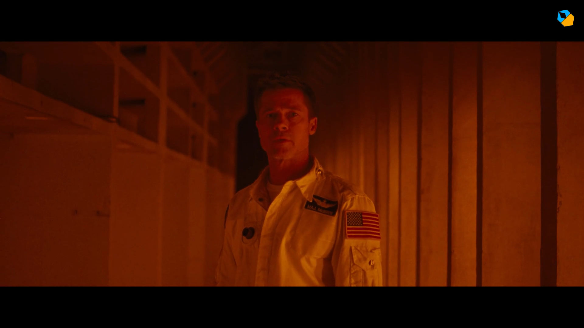
Production design is the art of creating sets and even worlds. The production design of films like Blade Runner and Ad Astra stand out for being unique and immersive.
The trend for a lot of artistic production design is to decide on one dominant color for any set. This color is what the audience will notice.
The second color is usually picked for contrast. A single color gets boring quickly. Here are a couple of monochromatic frames:

There’s a lot to be said about black and white films, but the world quickly forgot about it when color came along. Color is important.
But there is something cool about black and white. It draws your attention to the things in the frame, without colors distracting away from what should be in focus. This particular quality of black and white was very hard to achieve in the early days of color film. Today, they achieve that kind of focus with two colors. Two colors forms a sort of rich, unified look that defines the world the character is in.
The production designer and cinematographer decide what objects are what colors. The costumes, the props, everything is meticulously planned so the overall objective is obtained.
This kind of color coordination goes way beyond the terrible orange and teal look that Hollywood films had about a decade ago. Some films still continue that, because in many ways it’s a version of the two color look. You have orange for skin, and teal for everything else. This is a natural color combination because these are the two main colors in our life. The blue of the sky and oceans, and the warm orange of the sun and firelight. And of course, skin tones. By enhancing only these colors and subduing everything else, you achieve a sort of black and white look, but with color.
The other objective of using orange and teal is that these colors are on the opposing ends of the color scale. They contrast each other, and separate each other.
The second color, for “support” and “harmony”
Production designers always try to find two colors that are in opposition or harmony to each other.
They do this for every set in the film, and the production designer along with the director comes up with a plan for the entire movie. A color story.
The second color adds depth and actually enhances the primary color, so it can carry the responsibility of the mood of the story at that point.

Notice how the addition of one secondary color adds a ton of interest without distracting the eye.
The color must be harmonious, so it’s important to study color theory.
A couple more frames:


The orange and blue “space” theme is quite popular, as you can see from the above video.
Notice how the rest of the colors in the frame are neutral. Grey, black, white, beige, brown, etc. Skin tones belong to that category as well.
Color can be used randomly. You can always shoot what you get on location, and there’s a magic to that, too. But when you see two tone set designs, you can be sure the directors are using color to make a strong statement.
They are using color to its full cinematic potential.
What do you think? How do you use color?
I really like the aspect of two colours in production where two tone carries the dominants into the film.
Great instructional overview on this subject.
Thank you!
This was great. Thank you.
You’re welcome!
I absolutely hate Hollywood “Orange and Teal” and whoever came up with it should be banned from the industry. We spend so much time on the set trying to get lighting and colour correct and then some untrained numpty shoves a LUT on the grade because …everybody else uses it!
Some many films now are spoilt by poor grading. Colours are too saturated, skin tones are way off, unsuitable LUTs are thrown on because they are sold as the Ad Astra LUT or Saving Private Ryan LUT …without the training to understand that the films were alos shoty in a certain way to ensure the look of the film.
It makes me want to spit. Orange and Teal the worst thing to hit our industry alongside Covid 19