There’s something about black and white that makes every film look exceptional, if not better.
There is a “magic-factor” about black and white. But, the reverse isn’t true. A black and white film in color isn’t guaranteed to look good. That’s an interesting observation. In this article, let’s explore why black and white works for us.
Watch the video:

The Science Behind Black and White Films
The human eye is naturally sensitive to contrast.
In black and white images, the contrast between the darkest blacks and the brightest whites is at its maximum, 100% contrast. This high contrast is easier for our eyes to process, making details stand out more clearly.
Eye doctors use high-contrast black and white Snellen charts to test vision because they are the easiest to read. To understand how the eye resolves details, check out this video and article:
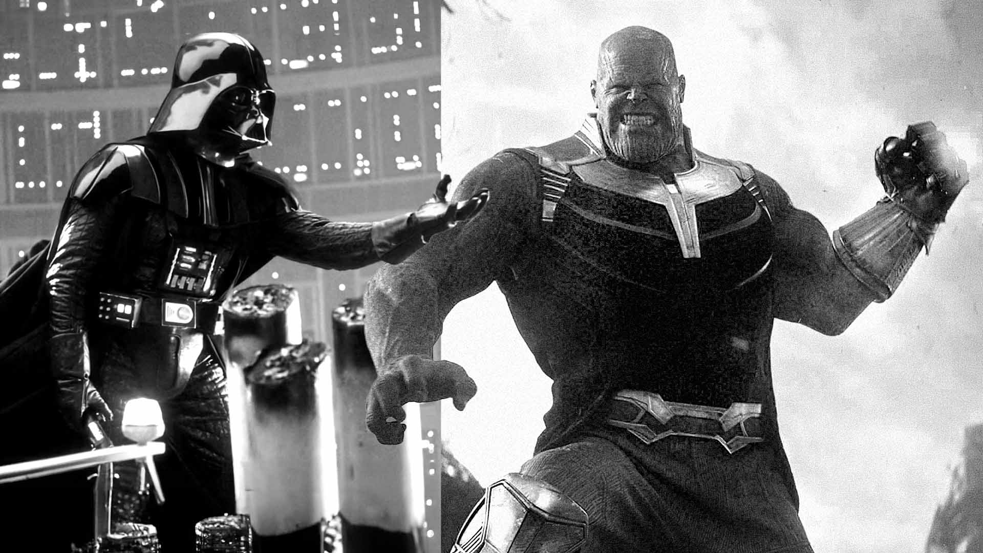
One of the really cool experiments you can try is to take away the grays from a black and white image. It’s still easy on the eyes. If you replace black with a color, it’s barely tolerable for a brief period.
Is this better:

Or is this one:

The black and white version is way easier on the eye.
Low contrast black and white films are also harder to watch because our visual acuity decreases with reduced contrast.
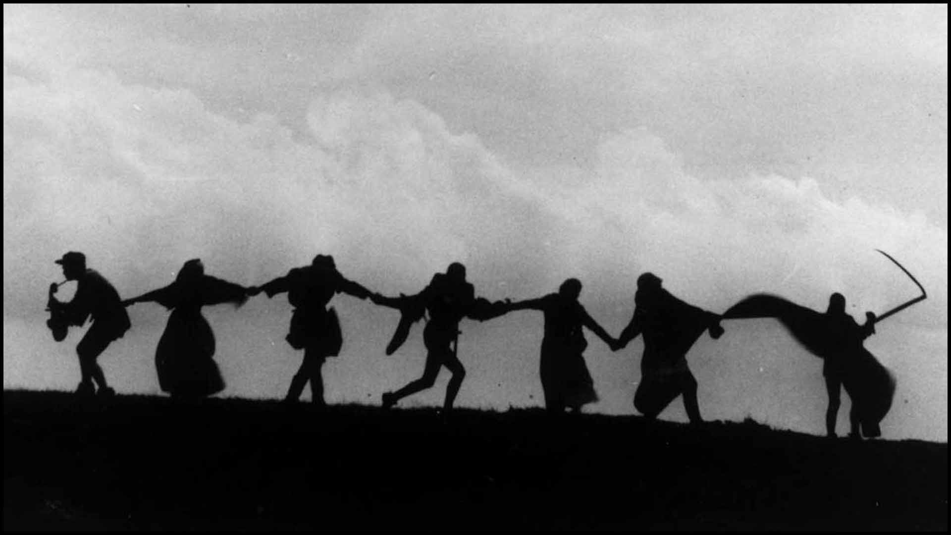
Look at this silhouette, from The Seventh Seal:
Does it look more three-dimensional than this (The Lighthouse):
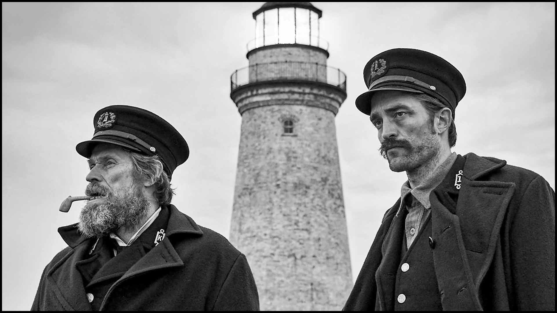
When a film has true blacks and whites, with tolerable grays, it introduces three-dimensionality and form, enhancing the viewing experience.
Emphasis on Texture in Black and White Films
One definite advantage of black and white is, once you strip away the color, your emphasis shifts more to the texture of surfaces.
When texture is emphasized over color, you can practically feel the wall paper or the surface of the wood.
I shot a short film last month, called Palindrome. We had two actors wearing satin night clothes, and they looked fine in color. But, they look otherworldly in black and white.
Here’s the finished short, called Palindrome:
Composition and Form in Black and White Films
One of the key reasons black and white films are visually striking is their focus on composition and form. Without the distraction of color, viewers can better appreciate the shapes and lines within a frame.
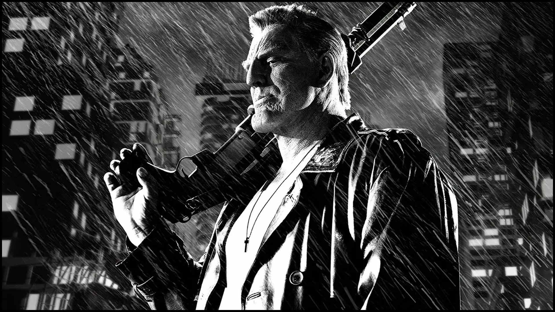
Here’s a good example of it from The Big Combo:

The hard shadows create distinct shapes that enhance the composition and guide the viewer’s eye to specific areas of the frame.
Large parts of the frame can be left in shadow. And, we don’t question it, even though in reality, we don’t see complete darkness like that. Our eyes appreciate this choice because it simplifies where to focus. The rest of the frame is less important.
Simple shapes are also easy on the eyes and brain. It’s easier to process and understand. And quicker.
Black and white also allows for the use of hard light and shadows, common in film noir and neo noir film genres. These hard shadows create shapes that help in composition and guide the viewer’s eye, making the visual experience more controlled and intentional.
A coherent and artistically impressive image is a timeless combination that remains pleasing to the eye.
Visual Consistency with Black and White
The lack of color gives black and white films a higher level of consistency, from shot to shot, or scene to scene.
This allows an easy path to continuity that’s hard to achieve with color. You have to work hard in production design, lighting and costumes to get colors to be in harmony.
It helps low budget films like The Night of the Living Dead to look a lot more expensive than its budget.
What is so Important About the Colors Black and White?
You can achieve a moody and atmospheric effect on color, but it’s much easier to create in black and white.
Black subconsciously reminds us of nighttime and the inherent dangers associated with it. This is particularly evident in film noir, where high contrast lighting and deep shadows create a sense of mystery and tension. Collectively, we are not always happy or optimistic in darkness.
On the other hand, white is associated with a sunny, bright day. It is cheerful and gives us more optimism.
Black and white films also tend to have a timeless quality. They don’t age in the same way as color films do. In some ways the color is a dead giveaway of the time period of a film (among other cues like costumes, hair, setting, etc.)
But, restored black and white films are incredibly satisfying to look at. If you took away historical cues, you wouldn’t know which period they were from.
This timelessness makes black and white films more enduring and appealing.
Do you connect better with actors in black and white?
I’m not sure this is completely accurate, or statistically verified.
There’s a widespread belief that black and white films make it easier for audiences to connect emotionally with actors. Faces and expressions become more pronounced without the distraction of color.
Let me know in the comments below about what you think.
Is Black and White about Good and Evil?
Some people say black is evil or white is good. Setting aside the racist tone of this association, I think most people just take it in a more religious sense.
However, this point of view doesn’t translate to most countries. In many cultures black brings good luck. People in India wear white when mourning. Yin and Yang is black and white, representing balance, etc.
This association doesn’t stop directors from using it in film. In Psycho, before Marion Crane steals the money she’s wearing white. After the robbery, she’s wearing black. It would be a rare person who’d have noticed the difference on first viewing. Even though film directors often make such associations in their films, it isn’t the cause of black and white.
Alfred Hitchcock didn’t film Psycho in black and white for aesthetic reasons. He wanted to save money, and not show the color of blood, to avoid censorship.
On the whole, I don’t think audiences collectively think of good or evil when they see black and white colors.
Artistic Choices and Modern Applications
Directors often choose black and white to evoke a particular mood or artistic vision.
For instance, Alfonso Cuarón’s Roma and Steven Spielberg’s Schindler’s List used black and white to strip away the color of the settings and focus purely on the stories. The lack of color deprives the worlds of one dimension, so to speak.
Films like Sin City take a step further by stylizing it. Sin City used color pops and toned black and white imagery to create an expressionistic visual experience.
Why don’t Black and White Films Work at the Box Office?
You’d be hard pressed to find more than a handful of films in the highest-grossers of all time.
Audiences prefer color films because they reflect the reality they see every day. Watching a black and white film can feel like a step removed from reality. It is one less stimulation, and cinema is a pathway to sensory delight. In simple words, people watch films to enjoy themselves and be entertained.
Many people also associate black and white films with being old or outdated. They don’t recognize the actors or stars. The actors are speaking in a language that’s not modern. You don’t have to dig deep to understand the people shown in older black and white films just don’t mirror modern society.
Occasionally, black and white films do make it at the box office. The films I’ve referenced in the above video have been hits.
However, the question is: Would those films have been bigger hits if they had been made in color? I think it is a safe bet to believe so.
Our article and essay is about the beauty of black and white films, and why they look better. In that respect black and white films emphasize composition, lighting, and texture to create a timeless and universal image that’s pleasing to the eye.
Whether for artistic, historical, or practical reasons, black and white cinematography continues to captivate filmmakers and enough audiences to keep it alive.
What do you think?
I believe The Beatles’ “A Hard Day’s Night” is vastly superior in black and white than it would have been in color. It just makes what we’re seeing timeless. Their “HELP!” is just the opposite…it’s very specific to the period that it was filmed.
For me, part of the “magic” of “Citizen Kane” and “Tough of Evil” is that they are in B&W; it makes them more “realistic” to their time and emotional feel.
Can’t imagine either in color!