
If you’ve ever watched a visually striking film and found yourself mesmerized by how everything just feels right – the colors, the lighting, the overall atmosphere – chances are, you’re witnessing the deliberate use of color theory in action.
The colors on screen are rarely random; they are part of a well-thought-out design meant to enhance the mood, tone, and emotional impact of the story.
In this video and article, we’ll break down the 60-30-10 rule – a popular formula in filmmaking and design that helps simplify color choices and ensures a cohesive and impactful visual experience.
Watch the video:

What Is Color Theory in Filmmaking?
Color theory is the practice of using color to convey meaning and emotion. It’s not just about making things look good—it’s about making a statement. Whether it’s the color of a piece of furniture, the tone of the walls, or the shade of a character’s clothing, every color you see on screen is chosen with intention.
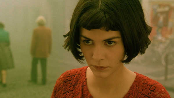
Take a look at visually distinct films like Amelie, The Grand Budapest Hotel, or Mad Max: Fury Road. The use of color feels harmonious and purposeful. The filmmakers didn’t just throw colors together at random; there’s an intelligence behind the choices.
That’s the essence of color theory at work in filmmaking.
The 60-30-10 Rule
The 60-30-10 rule isn’t new. Tt’s been around for centuries, originally used in art and design. Today, it’s widely employed in film, interior design, and even architecture.
The 60-30-10 rule is simple:
- 60% of the frame is dominated by one color.
- 30% of the frame is made up of a secondary color.
- 10% of the frame is reserved for a highlight color.
This formula creates balance and depth in a scene, making it feel more visually coherent.
But why 60%? And why not just have one color dominate the frame entirely?
Understanding the Dominant Color
The dominant color, which makes up 60% of your frame, sets the overall mood and tone of the scene. It’s not just one flat color, though; there can be variations of it—lighter, darker, or different hues within the same family—to add depth and dimension to the frame.
The key is to choose a dominant color based on the scene’s emotional requirements. Is the scene high-energy or melancholic? Does it take place in broad daylight or in a shadowy nightclub? The dominant color sets the tone and helps the audience feel what the characters are experiencing.
For example, in Mad Max: Fury Road, the dominant color is often a scorching orange, reflecting the harsh desert environment and the intensity of the action. In contrast, Amelie uses warm yellows and greens to create a quirky, whimsical tone.

The Role of the Secondary Color
The secondary color, which makes up 30% of the frame, serves as a complementary shade that supports the dominant color. Its role is to provide balance and prevent the frame from feeling flat or artificial.
Without a secondary color, the frame could feel overwhelming or unnatural, as though everything is bathed in a single light source.
A well-chosen secondary color also helps create realism. No scene exists in a vacuum, and the second color helps ground the action.
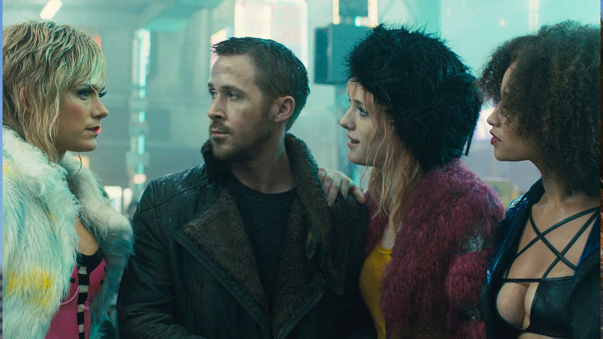
In Blade Runner 2049, the predominant use of muted grays and blues creates a dystopian mood, while pops of orange serve as the secondary color to add a sense of contrast and unease.
The Highlight Color: Making a Statement
The final 10% of the frame is reserved for the highlight color. This is the color that draws attention to specific elements of the scene – whether it’s a red dress, a blue umbrella, or even a bright yellow object that stands out against a muted background.
The highlight color makes a statement and often carries symbolic weight.

Take the classic red dress used in Schindler’s List. A pop of red serves as a powerful visual tool, drawing attention to a key moment of the narrative and symbolizing innocence amid tragedy.
The highlight color is also used strategically in Italian Giallo films of the ’60s and ’70s, where muted tones dominate the frame, but shocking reds punctuate scenes to heighten suspense and horror.
How Do You Actually Get 60-30-10 Colors?
Many people assume that most color design is done during color grading. While color grading can enhance and adjust colors, it’s not where the color design is typically done. In fact, trying to change all the colors in post-production is not only expensive but also less effective than designing with color in mind from the start.
Real-world objects – such as a red chair or a green sweater – reflect light and interact with the camera lens in ways that digital color grading cannot fully replicate.
When filmmakers use actual, tangible colors on set, whether in the production design, costumes, or props, they create a more authentic and cohesive visual experience.
Production Design and the 60-30-10 Rule
The production designer or art director is responsible for executing the director’s vision when it comes to color. They determine the color of the sets, costumes, and props, ensuring that everything works together to achieve the desired look and feel.
Take The Grand Budapest Hotel as an example. The dominant color is often a warm pink, evoking the nostalgia and whimsy of the hotel’s past. A secondary color, like muted blue, is used to complement the pink, while a highlight color (such as a character’s red coat or yellow uniform) draws the audience’s attention to key moments or objects in the frame.
Two-Color Films: A Popular Trend
Not all films use the 60-30-10 rule. In fact, some modern films like The Batman opt for a two-color palette, creating a moody, minimalist look.
In The Batman, the primary color is a dark, muted blue, while the secondary color is a shadowy grey. This combination creates a near-monochromatic feel, adding to the film’s grim, noir-inspired tone.
Watch more about it here:
By contrast, Uncharted employs a more vibrant look, with brown as the dominant color and blue as the contrasting secondary color. This is an example of the classic orange-and-teal palette often used in action films to emphasize human skin tones against vibrant backgrounds.
Color and Skin Tones
One important consideration when choosing colors is how they interact with different skin tones. Caucasian skin tones often register as light pinks or whites, blending well with a range of colors.
Darker skin tones, on the other hand, may require adjustments to the color palette to avoid visual disharmony.
Filmmakers must be mindful of how colors will render on camera and how they will complement various skin tones. What looks good on one character may not work for another, and thoughtful color design takes this into account.
Practical Tips for Low-Budget Filmmakers
If you’re working on a low-budget film and don’t have access to extravagant sets or props, you can still make your film look polished by carefully controlling your color palette.
Start by analyzing what you already have, whether it’s the color of the furniture or the shade of the walls, and use that as a foundation.
You can then choose a dominant color for the walls (paint is inexpensive and can transform a scene) and a complementary color for the furniture or props. Eliminate anything that doesn’t fit within your two primary colors, and be thoughtful about where and how you use your highlight color.
Make Color Count!
The use of color is one of the most powerful storytelling tools in a filmmaker’s arsenal. Whether you’re creating a high-budget feature film or a low-budget indie project, implementing the 60-30-10 rule or experimenting with two-color palettes can elevate the visual impact of your work.
Color is not just decoration. Tt’s a way to guide the audience’s emotions and draw attention to the most important aspects of your story.
By being intentional with your color choices and understanding how they affect the overall mood and tone of a scene, you can create a film that not only looks stunning but also resonates on a deeper, emotional level.
I hope you found this useful!
Very Thankful to you sir,
You’re welcome!
Very useful tip in a simplified way.
Been learning more and more to consider color than I have been to date. This video is an additional step up the color-consideration ladder. Thanks.
You’re welcome!
Great one Sareesh! This was extremely helpful as always.
Thank you so much for your time again .We greatly appreciate the time and knowledge you put in these video classes.
You’re welcome!
Been following you on and off for years. You’re only getting better. Thanks!
Thank you!