Brian De Palma’s The Untouchables came out in 1987. It’s a period gangster film set during Prohibition, and it follows Eliot Ness as he tries to bring down Al Capone. On the surface, it’s a crime drama. But visually, it’s a masterpiece.
Nearly 40 years later, it still looks stunning. The film is a lesson in visual storytelling. Let’s break down why it still feels like a billion bucks:

De Palma’s Eye for Composition
Brian De Palma is known for being stylish. In The Untouchables, his style meets substance. Every frame feels designed. He borrows from Hitchcock and classic noir but makes it modern.
De Palma uses symmetry, negative space, and clever blocking.
His camera movements are slow and deliberate. When the camera moves, it means something. It’s not flashy.
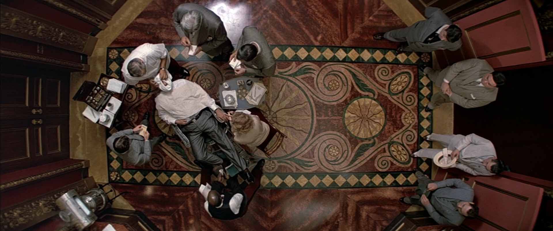
Let’s talk about the most famous moment in the film. The shootout at Union Station. A baby carriage rolls down a staircase in slow motion while gunfire erupts around it.
It’s pure cinema. De Palma borrows from Eisenstein’s Battleship Potemkin, but he doesn’t copy it. He adapts it for a modern action scene. The tension is unbearable.
The slow motion, the editing and the framing is all controlled. This is what happens when a director knows exactly what he wants.

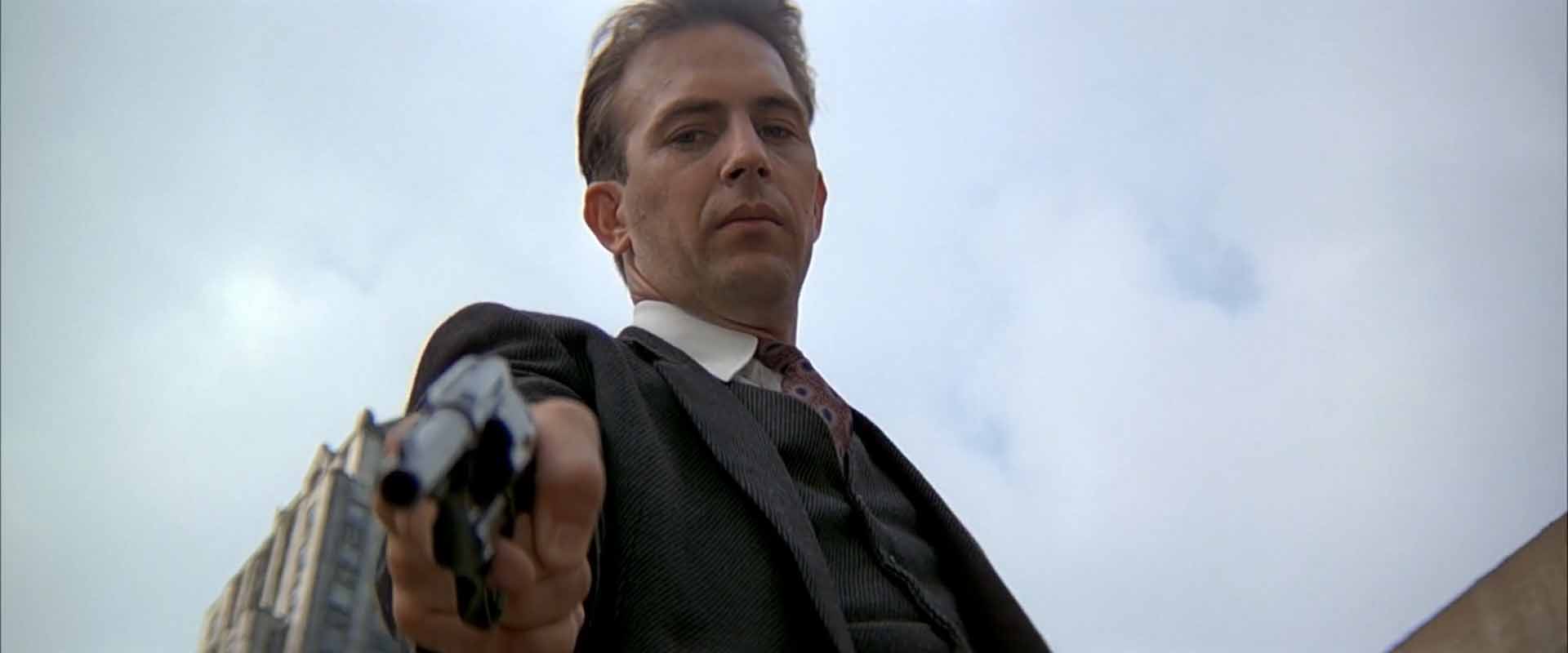
In the courtroom finale, Ness strides through the frame with purpose. Capone stews behind him, boxed in by extras. The blocking sells who has the upper hand – even before the verdict.
This kind of visual clarity is rare today.
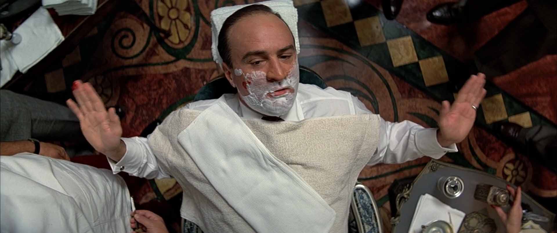
Even if you haven’t seen the film in years, you remember it. Capone with the baseball bat. Ness on the steps with a shotgun. The baby carriage. These are the kind of shots that burn into your memory.

Cinematography by Stephen Burum
Stephen Burum’s work here is bold and elegant. The film feels like Prohibition-era Chicago.
Lighting does more than make things visible. In The Untouchables, it builds mood. The contrast helps sell the moral tension.
Capone’s world is red, golden and plush. Ness’s world is cold and gray. When they finally collide, it’s satisfying – both narratively and visually.
The score
Ennio Morricone’s score is iconic. It’s moody, memorable, and full of texture.
The main theme is tough and marching. Somehow it combines the best worlds of his music for Sergio Leone and John Carpenter’s music in Halloween.
He was nominated for an Oscar and won a Grammy for this score.
The sound design is great, too. It has raw physicality. Guns don’t just shoot, they kick. Men don’t just fall, they crash.

The Untouchables still looks like a billion bucks because it was made with taste, control, and confidence.
The Untouchables reminds us what film style looks like. It’s not just a good-looking movie. It’s a beautiful one.