
When filmmakers set stories in space, they usually choose one of two paths:
- Speed: twisting dogfights, impossible maneuvers, fireworks of explosions.
- Silence: the terrifying weight of the cosmos pressing down on fragile humans.
Stanley Kubrick chose silence for 2001: A Space Odyssey, a film so monumental that even decades later, other movies feel like they orbit around it.
Start by watching the video:

A Divided Beginning
When 2001: A Space Odyssey premiered in 1968, it split opinion right down the middle. Many critics called it self-indulgent, confusing, even dull. But audiences had a different reaction.
Within weeks it was the highest-grossing film in America that year, outperforming grand spectacles like Doctor Zhivago.
You have to put things into context. The moon landing hadn’t happened yet. Kubrick’s bet had paid off: the movie he refused to explain was speaking directly to the imagination of the public.
Over fifty years later, his vision of space travel is not fantasy but a projection of what might still lie ahead. Laptops, tablets, video calls, flat screens, and even AI assistants – so much of our world was already there.

Order and Precision in Design
One of the most striking aspects of 2001 is its design language. Every surface is clean and textured. Every corridor is symmetrical. Every screen, label, and panel serves a purpose. This is not the cluttered, industrial future we later saw in Alien, nor the lived-in rebellion of Star Wars.
In the world of 2001 geometry dominates and uncertainty has been engineered out.

Look closer at the screens inside those ships. They appear impossibly modern: flat, square, and crisp, like tablets mounted in control panels. Kubrick projected 16mm film loops onto glass displays, synchronized with the camera, so the images looked sharp and free of scan lines. In some displays he did use CRTs too. This decision ensured the film doesn’t appear dated – at least not like the sci-fi films that followed that used CRT displays.

Architecture of the Future
The spacecrafts were physical models, built with meticulous detail. Their movement was slow and deliberate, like monuments drifting across the void.
Visual effects artist Douglas Trumbull pioneered new methods of in-camera composites, slit-scan photography, and optical techniques to achieve images that still hold up. A handful of planet shots may look simple by modern standards, but the vast majority of visuals remain seamless.

The interiors of 2001: A Space Odyssey feel less like sets and more like functioning buildings. The walls are illuminated so evenly they seem to stretch into infinity. The Hilton lounge feels like a real airport waiting room. Olivier Mourgue’s Djinn chairs still look futuristic, and wouldn’t be out of place today.
The centrifuge set remains legendary. When I first saw the film I couldn’t imagine they could build something like that in the 60s. Kubrick had an enormous wheel constructed that could rotate, allowing actors to walk while the set spun around them. The effect created the illusion of artificial gravity. Watching astronauts jog in circles inside the wheel still has the power to stun.
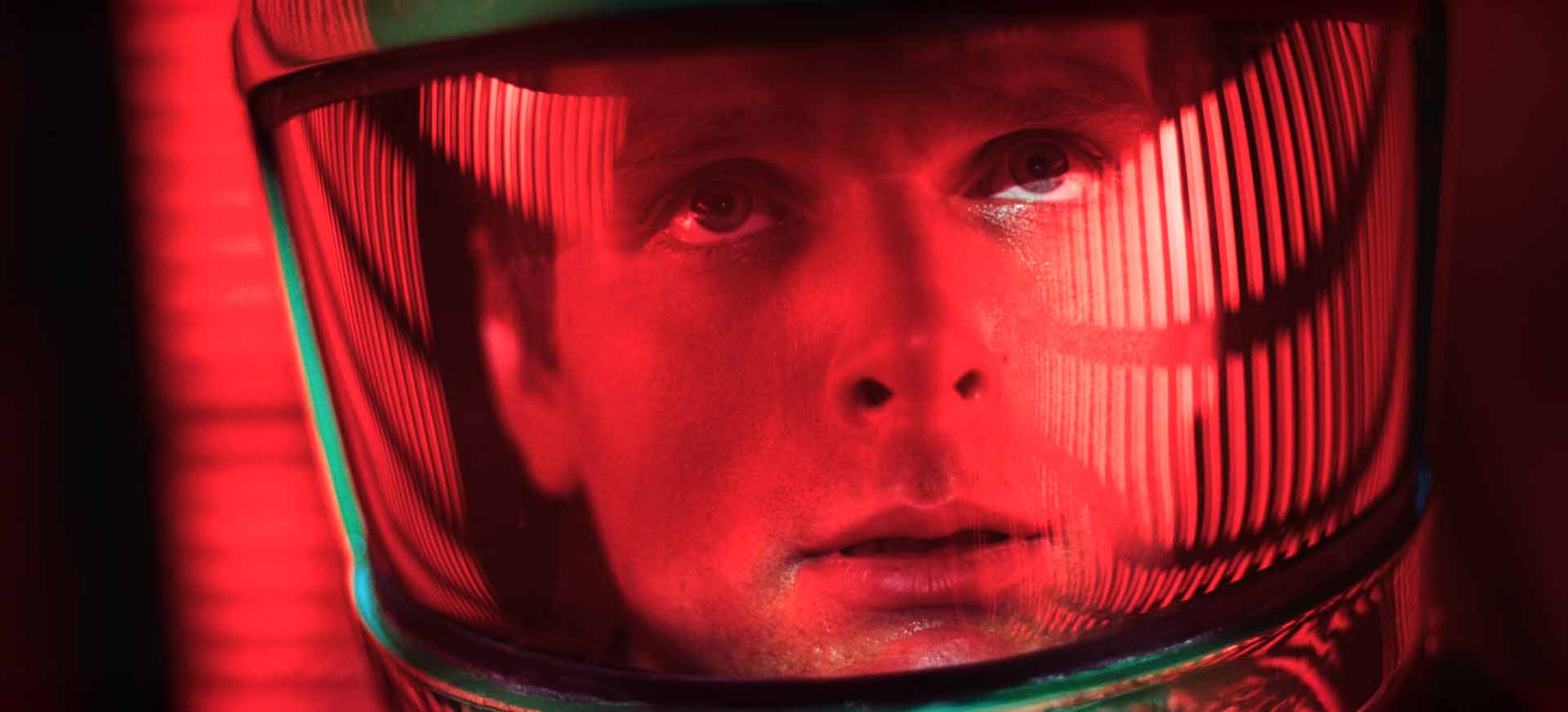
Even the clothing reflects the stark philosophy. Most of the suits (even the apes!) are brown, grey or black. Except when Bowman goes toe to toe with HAL – both symbols of red.
Also pay attention to the stitching and the hair styles. They avoid the trap of 1960s fashion and trends. Kubrick wanted a future that didn’t date, and he achieved it.
Language Through Typography
The film opens with Gill Sans, clean and modern. The Dawn of Man sequence shifts to Albertus, giving the sense of something older, rougher. Later, once we’re in space, typography shifts again into Eurostile, Microgramma, and Futura – fonts that came to define the look of “the future” in the second half of the 20th century.
Please read the following blog article that goes into excruciating detail into the typography of 2001:
The signage on doors, instructions on toilets, and corporate logos from IBM, Bell, and Pan Am all tell the audience this world is structured, engineered, and plausible. Typography itself becomes part of the storytelling.
The Icons of 2001: A Space Odyssey
Two images dominate the film: HAL 9000 and the monolith.
HAL is the most human of machines: a single red eye, always watching. Its voice is calm and measured, which makes it terrifying. HAL is not angry or loud – it is rational. And that rationality becomes lethal when combined with fear. The moment HAL begins to plead for its life remains one of the most haunting in all cinema.
The monolith, by contrast, is absolute mystery. A slab of perfect proportion, black and featureless, yet impossible to dismiss. In Arthur C. Clarke’s novel, it is described as having the ratio 1:4:9 – the squares of the first three integers. In the film, its aspect ratio aligns more with the widescreen image itself. Audiences have long wondered if Kubrick intended it to be a mirror of the screen, a symbol of cinema itself: the thing we face when we seek meaning.

Light, Space, and Silence
Cinematographer Geoffrey Unsworth shot the film with extraordinary care. He took over ten thousand Polaroids to test exposures, ensuring the futuristic sets glowed naturally. Control rooms were lit by their own panels. The centrifuge glowed with hidden strip lights. The neoclassical room in the finale was lit from the floor upward, creating an eerie and unsettling atmosphere.
Even though you remember 2001 for the music, there is no background score filling every moment!
In space, sound vanishes. When music enters, it dominates. Strauss’s Also sprach Zarathustra has become inseparable from the film, its opening fanfare now one of cinema’s most iconic motifs. The Blue Danube waltz transforms orbital docking into a ballet of machines. And Ligeti’s haunting choral works give the monolith its unearthly voice.
Kubrick rejected a commissioned score for these classical pieces, knowing they would never age.

More Than Science Fiction
Kubrick and Clarke insisted that 2001 was not just a story but an experience. Kubrick refused to explain the ending because the film was meant to provoke thought, not provide answers. Some viewers found it slow; others saw it as revelation. Over time, its status grew until it was recognized not just as great science fiction but as great cinema.
Watch this video I made years ago on the power of pure cinema, and how The Dawn of Man sequence exemplifies it:
For many, 2001 became the benchmark of how seriously cinema could take the future.
The film endures because it does not age. Its designs still look plausible. Its story still feels urgent. Its themes – evolution, technology, the unknown – still define our place in the world and probably always will.

Most films try to entertain. 2001: A Space Odyssey holds up a mirror. It reminds us that space is vast, silent, and uncaring. And even with all our progress, we remain small against the cosmos.
Yet the film is not despairing. The Star Child looks down on Earth not as a conqueror, but as a new beginning. Kubrick leaves us with awe: a sense that humanity’s journey is only beginning, and that our destiny may be stranger and greater than we imagine.
2001: A Space Odyssey is like a temple of images and sounds that overwhelm and transform. That is why half a century later, 2001 remains the film that defines what movies can achieve, and why every time we return to it, we come away changed.
What do you think?
Hi Sareesh, I have been devouring your content for several years now. This last vid on 2001 is obviously been thrown together with /the help of AI. The mispronunciation of words , the choppy cadence lack your normal meticulously crafted essays. I hate to say I turned it off after a few moments. If you actually made this I implore you to revert to your previous methodology. I find AI created content really annoying. If you continue down this path I will have to abandon your insights and wisdom. Please reconsider your trajectory, your Fan and student, Dana Ray
Thank you for the feedback. I can assure you the problem is not AI, just that I was recovering from an infection and had to get it done or lose another week. Also I had the insane idea to make the essay sound like the dialogue cadence in the film. Will try to do better next time!
Your final paragraph epitomizes exactly why 2001 has achieved such a magnitude of “great” (a label that I use very, very sparingly). It is the film that got me into film, and I’m very lucky to have experienced it in the original Cinerama format. It is the film in which dialogue is mostly banal, and the filmmaking pure, rapturous and astounding. It launched into my number one all-time position when I first saw it in 1970, and it has not been challenged (yet….)
Thank you for sharing! I can watch it forever and never get bored.