
In this article I’ll explain what I understand by film emulation and how I applied it to my second feature film, Gin Ke Dus. I hope my thoughts on the process will help you arrive at your own film emulation system.

Important: For the sake of clarity, from here on out, I’ll call a feature film a “movie”. When I refer to “film” I’m referring to film stock or the film process.
What is film emulation?
What is film emulation?
Film Emulation is a sequence of manipulations made to digital footage of a scene so it tries to resemble what the same scene would have looked like if it were shot and printed on film stock.
The key phrase is “tries to resemble”.
Here’s the TLDR; It’s virtually impossible with today’s technology to simulate the effects of film exactly; for multiple reasons.
There is a whole chain of events that have to be designed precisely, and by that point it might be just better to shoot on film! If you want the details, continue reading.
So, for anyone who wants to tackle film emulation, you need to ask yourself an important question:
Does your movie require:
- True film emulation (the exact look of a particular film process), or
- A result that looks “film-like”, with some of the properties of a film process but not others?
Your strategy, budget and workflow might change depending on your answer. Let’s look at them both, and later I’ll explain what I picked for my movie and why.

True film emulation, or “scientific” film emulation
This is barely doable. I know there are examples online that have achieved true film emulation under controlled conditions, but it’s not the whole story.
The problem of the film workflow
There are different types of film stock, selected for the effect you’re trying to achieve, or its place in a film processing and distribution pipeline.
Some of the important ones are:
- Negative stock (black and white or color)
- Reversal film stock (typically color)
- Intermediate film stocks
- Answer print stocks
- Release print stocks
Video codecs offer a sufficient analogy to understand the distinctioni between these film stocks.
A camera records in RAW, let’s say. That’s like unprocessed negative film stock. Debayering is similar to film development in a film lab with chemistry, so you get an image to look at.
The look applied on the digital footage (via. LUT) makes it work like reversal film, but the RAW file maintains the original negative. It is encoded as Log most times. If you want to understand more about this difference, watch this:
Intermediate film stocks are like intermediate codecs like Prores 4444 or DNxHR 444 (or their 422 variants). The primary purpose of anything intermediary is to survive different iterations. The chemistry of intermediary film stock is designed for these iterations.
Print or release stocks are similar to either:
- high-quality delivery codecs like Prores HQ or 422 (print film, the best quality of the film), or
- highly compressed codecs like JPEG2000, H.265 or VP9 (answer prints, just enough quality for display but not for further manipulation).
Video codecs are designed for a specific purpose. RAW codecs are designed to hold the best image quality from a camera, while intermediary codecs are designed to maintain data fidelity over multiple render iterations. Delivery codecs are designed for the smallest file size while maintaining sufficient visually lossless image quality so the end user (the audience) can’t tell the difference.
The key takeaway here is: each of the film stocks in the film process pipeline introduce their own characteristics on the final movie. E.g., if you combine Negative A with Answer Print W and Release Print Y you get one result, but a single change in any of the film stocks will give you another result.
The two big manufacturers of film stock were Kodak and Fuji. They each had their negative films and print films, and these typically kept changing every decade or so. There were others like AGFA, but today, only Kodak remains. It was not uncommon for a film to be shot on different Kodak stocks and printed on a Fuji stock, like The Lord of the Rings: The Fellowship of the Ring:
- Negative stocks: Kodak Vision 200T 5274, Vision 500T 5279, Eastman EXR 200T 5293, SFX 200T
- Print film: Fuji F-CP 3519D
- Intermediate format: DI (digital), due to the extensive visual effects and color grading involved.
Each of the Kodak stocks would give a different look in terms of resolution, grain, halation and color, etc., and printed on Fuji would look very unique. Yet, what most people saw was the final graded 2K version.
Major motion pictures had to create hundreds if not thousands of release prints for worldwide distribution. Sometimes it’s not the same release film stock. You might have one print film in territory A and another in territory B.
If this weren’t complex enough, things got more complicated when telecine and film scanning came along. This led to DI (digital intermediate, analogous to color grading today).
There are too many steps, too many variables, and this does not even consider other complexities like the state of the theater, the projection lamp, projection screen, etc. If most films started with a pristine resolution of 4K in the negative, most of the world saw it in roughly 1.5K to 1K by the end. A good theater could be expected to present a 2K equivalent, which is why DCP standards are set at 2K and 4K.
Let’s bring closure to this. Any true film emulation software must declare the film stock(s) it is applying, and in which order. This is only the first part of the battle. Then there’s the nostalgia “factor”.
The problem of old film stock
There are very few film stock varieties available today.
To create a scientific film emulation, you could purchase a few cans from Kodak (or another party), profile them and design an accurate transfer LUT from a particular camera.
What about discontinued film stocks? You can’t buy them anymore. If you find them are they in pristine condition? How do you know that?
Any software or individual that promises true film emulation must have profiled one or all the film stock options available. They also need to provide the exact options in the software so the effects can be reproduced.
That’s not all. Let’s say you (or that person promising the snake oil) see the final result. How do you know the result is exactly what the film stock and process would have accomplished?
Remember, the person profiling the film stock only did so with a sample, but there’s no way to know how exactly film would behave under different conditions – weather, time, storage, lab chemistry, lab workflow, etc. E.g., the chemistry that was available in the 60s or 70s isn’t available today. How are you going to develop the film in the same way even if you found enough stock to make your movie?
Is it possible to precisely emulate the characteristics of film stock and projection?
There are three answers to this question:
- Yes! How? Shoot film, develop it, print it and project it on a film projector!
- How about if you film digitally?
- Yes! How? Follow these steps:
- Know the precise film stock, development chemistry, printing pipeline, etc., and have true simulations of these chain of events so you can painstakingly recreate everything.
- Know the precise color science and characteristics of the sensor of your digital camera, and how it was debayered and mapped to form the final RAW/log/raster image that forms the starting point of your digital footage.
- Film the same scene with both digital camera and film stock, and arrive at the precise mathematic transformation from one to the other in such a way it can be reproduced by anyone.
- And finally, work on each shot individually knowing the circumstances of exposure and any filtration applied, along with the lights used, daylight conditions, etc. The reason for this is your digital camera reacts differently to light and color than the chain of events that went into creating the film look you’re after. An algorithm won’t completely solve your problem, so some creative guesswork is required. At the very least, a human is required to review the results.
- No, for every other pseudo-workflow!
- Yes! How? Follow these steps:
There’s still a bit of artistry and subjective choices that need to be made during this process. No two people will get the same result even in the most ideal of conditions. This is the very definition of unscientific. Science demands an exact reproduction of results!
Therefore, this is the conclusion I’ve arrived at:
Is film emulation scientific or a worthy pursuit for most movie projects?
Emphatic No.
You can’t precisely emulate the film look unless you approach it in a painstakingly mathematical and scientific way. Due to the subjective decisions that have to be made anyway, the process is unscientific by design and will never satisfy the requirements of science.
Even if your objective is to just get 99% of the way there, it is beyond the scope of most movie projects, even ones with deep pockets. If you really had the money, you’d pick the first option and just shoot film!
If your movie requires a result that looks “film-like”, with some of the properties of a film process but not others, then you’re not after “true” film emulation.
What can we call this? Let’s just call it the “film look.”
It’s a whole new can of worms.
What is the film look?
If you hadn’t seen a movie (shot on film) projected in theaters, you might have watched it on Blu-ray or on an online streaming platform.
Where did you see the movie you thought has the film look? The answer to this question is of critical importance.
What is the basis of your understanding of the film look?
If you’ve seen a movie shot on film digitally, it means a digital version of the movie was created at some point. Unless explicitly stated, it’s impossible to know for sure how the digital version was created, and what changes were made.
Here’s what might have been done to the movie before you saw it:
- It might have been color graded, thereby changing the original film look.
- It might have been scanned in a color space or gamma mapping that changes the properties of the original film.
- A particular answer print was scanned to create the digital master when other kinds of answer prints existed.
- A negative was scanned, but we don’t know if it was the original camera negative developed (in which case it might have aged and changed colors, etc.) or the internegative or other versions in the pipeline.
- A telecine was used, where the quality control parameters and methodology is unknown.
If you had watched the movie projected on film in a theater, you’re going by memory. You have to ask yourself if your memory is really that reliable, or important! Do you really recall the colors, tonality, texture and contrast of the movie as a whole?
Human perception isn’t a constant. It changes with age (among other things). You can’t rely on your memory alone.
Some of us are lucky to still catch a few movies projected in theaters, but these theaters are few in number and only show us a small sub-section of movies. There was a time before the turn of the century when every theater showed nothing but projected film.
I watched movies projected on film during the 80s and 90s, and I can’t tell the difference when I see the same movies again on Netflix or on Blu-ray. I don’t think I will be able to tell if a change has occurred even if I saw the same movie projected again in the exact same theater! Age. What can I say?
I’m going to go out on a limb and say there’s nobody who can claim to remember the precise nature of a film look decades later.
Therefore, it’s important to first understand which version of the film you’re watching, and that would be the basis of what you consider the film look.
Here’s an example of a frame from Blade Runner (1982) in three versions. Which is the original film version? Other than those who actually worked on the film, I don’t think anybody can tell.
You pick the one you like:
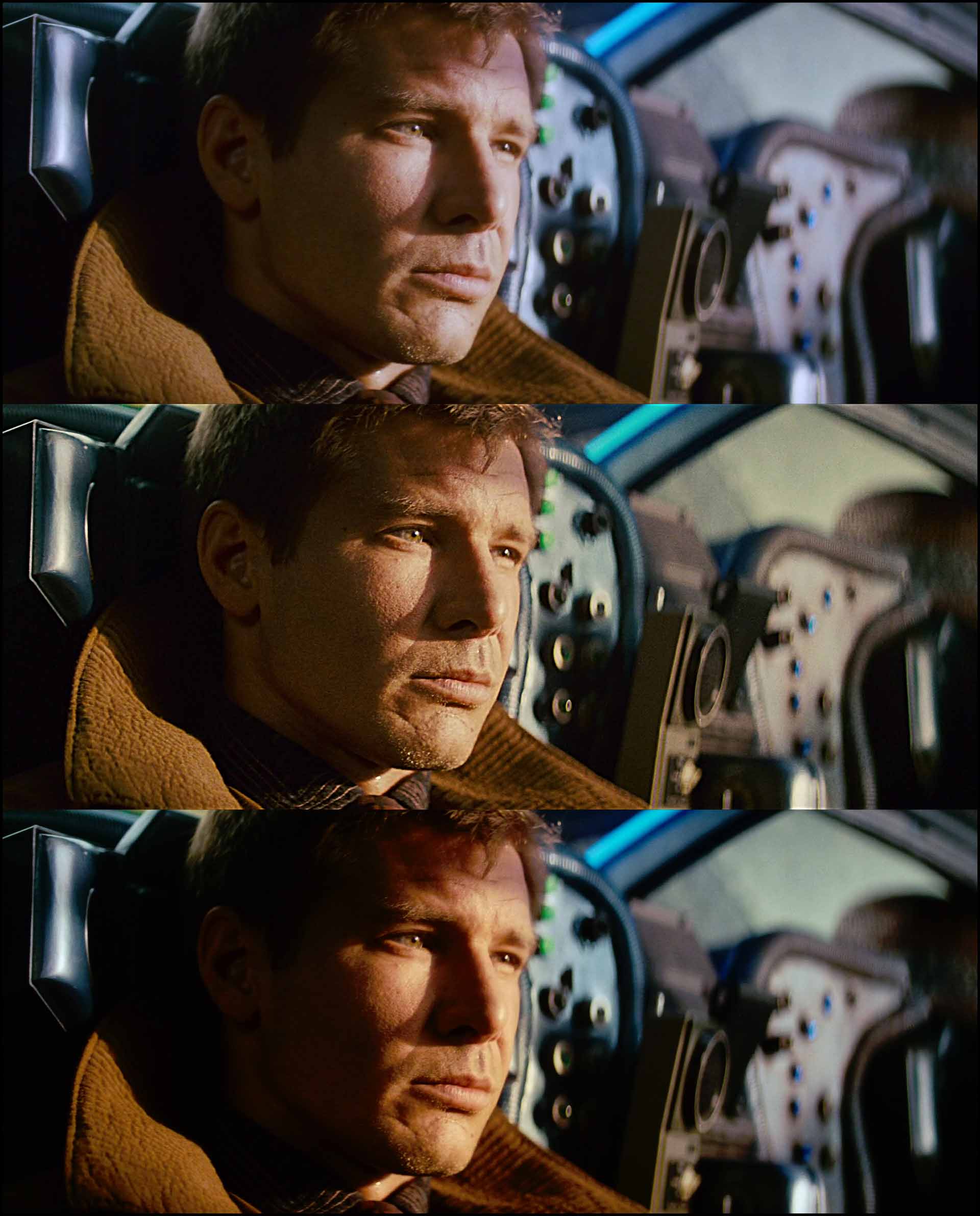
I’m not going to answer this, because I don’t know!
The key takeaway here is to define what the film look means to you. I’ll break down some factors below to help you out as a beginner, but the first step is to know which version of the movie you’re watching, and on what device.
The importance of production design
A lot of the times you’ll see people talk about the look of a particular film stock. The most popular one nowadays is the look of print film Kodak 2383.
Here are stills from three movies shot on the same stock:
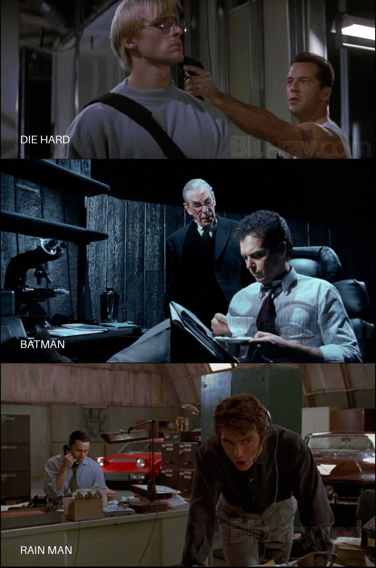
Here’s what’s common among these three images:
- The movies were shot on the same negative: Kodak Eastman 400T 5295
- They were printed on the same print stock: Kodak Eastman 5384
- They were shot within a year or two of each other
- They were all shot with Panavision cameras but different lenses
- The stills were taken from official Blu-ray versions
Do they all have a “one true film look” that you can extrapolate to your movie? Can one setting or LUT or sequence of corrections be applied to every footage so they look like one of the movies above?
Of course not. Try it and see for yourself.
The “look” you see is a combination of several factors: the set, costumes, makeup, lighting, lens, aperture, negative film stock, filters, chemistry, print stock, and the display format.
Most people erroneously associate the film look with the film stock, but what you’re mostly seeing is the production design. If you shoot an unknown actor against a white wall with an Arri Alexa, and if you replace the actor with Brad Pitt, and shoot it again, you’ll get the same video, theoretically. However, statistically people will associate greater production values to the one with Brad Pitt in it.
Psychology plays a lot of tricks on the human mind. I’ve seen this pan out many times. People think the lighting and cinematography is great when actually they’re seeing good production design.
I’ve seen low budget movies shot on film that looked like “video”, and I’ve seen high budget movies shot on film that look like video. I’ve also seen movies shot on digital that look great to me (I don’t say they “looked like film” because who knows what that is).
Therefore, it is important to separate production design and production values in general from your understanding of the film look. Are you really judging the film stock and film process, or are other unrelated factors contaminating your judgement?
Bottom line, there is no universally accepted definition of the film look. You pick the definition that makes the most sense to you.
The film look should serve the movie. If the look distracts, something is wrong. E.g., The Blair Witch Project and Paranormal Activity have as much a film look as Avatar or The Godfather.
Sometimes a look doesn’t work out. A good example is The Hobbit, which was projected digitally in 48 fps in some theaters. Many people hated the video-like motion. I don’t mind the effect, but in this case I feel it didn’t work for the film. The Hobbit didn’t need 48 fps, just as many movies don’t need to be shot in 3D, or 65mm, or with whatever combination of camera, lens, etc.
This also applies to shooting on film. The Nolans and Tarantinos have things sorted in terms of budget, and they know their movies will be distributed worldwide. They can afford to shoot on film. Can a typical low-budget filmmaker splurge on film to the detriment of production design and acting? No.
What’s left, then?
The rest of this article assumes you’re NOT after true or precise film emulation, but a subjective opinionated and unscientific idea of the film look that might only make sense to you (or maybe not even that if you happen to change your preferences as time passes on).
My definition of film emulation:
Film Emulation is a sequence of manipulations made to digital footage of a scene so it resembles what the same scene would look like if it were shot and printed on film stock.
We already know it won’t be scientifically accurate. What we’re looking for are specific qualities or attributes we identify as contributing to the film look.
E.g., if film emulation required twenty steps (just a random number), say, you get to pick how many of those steps are important to your idea of film emulation. Maybe it’s nineteen, maybe just one. It’s your call, entirely.
I’ll try to explain what I’ve learned about the film process, and you can decide for yourself which steps are important for you.
Let’s begin.
Which path did I choose for my feature film?
For me the first question was, should I be bothered with film emulation in the first place?
I was going to shoot my movie with the Canon EOS R5 in 8K RAW Canon Log 3. We were shooting for 30 days for a two-hour film. I had shot this test video earlier on the Canon EOS R5:
This short test was graded with the Canon Log 3 to 709 LUT that Canon provides, in Rec. 709 color space in Davinci Resolve. I didn’t use any color management because I wanted to see all the colors as Canon sees them. I like Canon colors.
I was fairly happy with the results, and considering it’s a test video I think the results are quite cinematic. It looks better than a lot of movies shot on film I’ve seen earlier in my life, so I know I’m good.
However, for Gin Ke Dus, my second feature film, I decided to take a different route for one simple reason. The movie is set in 1991, and I wanted to emulate the look and feel of Indian movies I’d seen during that time.
When I used the in-built color management in Resolve, and ACES, and the Canon LUTs, I didn’t get images that matched my memory of Indian films (specifically from Kerala). Typically films in India were shot on Kodak stock, though Fuji was popular as well. I prefer the look of Fuji stock, and that formed the basis of the color language of Gin Ke Dus.
After testing many looks and grading methods I decided I liked how the built-in Fuji emulation in Resolve looked, and it was the one that best represented my film (I am also the cinematographer). All my decisions would be based on this crucial decision.
Of course, I didn’t just stop there. For due diligence purposes I applied different looks and grades over different edits to reduce bias, but I always returned to the Rec 709 Fujifilm 3513DI D60 LUT.
The last question I had to answer was: LUT or Powergrade?
After a lot of testing I decided I needed to go the LUT route because that’s the image I responded most to. Recreating it in a Powergrade didn’t make sense because why waste time when it’s already 90% there with the LUT?
It doesn’t get any more subjective than that! For those of you who don’t know:
A LUT is a complex transform that cannot be replicated by grading tools. You might be able to get one shot to match, but the same changes (nodes) copy-pasted won’t make the other shots match unless the shots are already matched beforehand.
On the otherhand, Powergrades rely on the expertise of the colorist. There’s no simple answer here.
I would start with the strategy that gets you closer to your intended result. The Rec 709 Fujifilm 3513DI D60 LUT gave me that.
In addition to this, I also researched many films shot on Kodak and Fuji in the late 80s and early 90s. I was studying how the colors looked, and how things translated to Rec. 709 on OTT platforms and on Blu-ray.
Many other production-related decisions were made to support the narrative. Gin Ke Dus is a micro budget film, so our options were extremely limited to what we could accomplish. I tried to emulate the lighting from that period (Indian films, not Hollywood). This meanas using hard lights and working with minimal sources.
All things considered, I’m pretty happy with the results.
Let’s go over some of the considerations in how I went about creating the film look.
What are the characteristics of the film look?
This is not an exhaustive list, but only the major ones I’ve come across. I’ve not applied all of them for my movie, but you should be aware of them all. Pick what makes sense to you, discard the rest.
1 The “A” Look
Who cares which film stock or process it looks like? If you like what you see, and you feel emotionally drawn to it, that’s the look you want.
It could be a simple Color Space>Rec. 709 LUT, like the ones every camera manufacturer provides. Tons of films have been finished with the default Arri Alexa to 709 LUT applied. Roger Deakins is an example of a famous cinematographer whose filming LUT is close to the default LUT.
Start in these places:
- Manufacturer LUTs downloaded from the official website or the camera, or app
- Color Management LUTs in apps like Resolve, Baselight, etc.
- Third-party LUTs
- Looks created using node trees only, otherwise known as powergrades in Resolve language.
- A combination of the above.
It doesn’t matter where you start from, only that you start from some place that really benefits the movie. If it doesn’t add much to the default look then why bother? Whom are you trying to please?
All the other characteristics of the film look are secondary to the primary look you’ve decided.
If you think it looks like “film”, that’s all that matters.
2 Highlight Roll-off
Blowing out highlights is normal in cinematography. As I’ve shown many times on my YouTube channel, great cinematographers have done it countless times.
It’s how you blow out the highlights that matter. A lot of people attribute blown-out ugly highlights to dynamic range.
That’s wrong.
Old color film stock had a dynamic range of 9-10 stops. Modern film stock has a dynamic range of about 14 stops, give or take, and many digital cameras trump these numbers.
However, when film blows out the highlights, the gradation or transition between image information and blown out region is graceful. Scientists working for Kodak and Fuji have had about a hundred years to perfect the film look. Digital cameras have only had about two decades so far, so I’m pretty confident in another ten years all this will be a moot point.
You should be looking for a camera whose highlight roll-off you like. A lot of cameras have sufficiently pleasing highlight roll-off. I like how the Canon EOS R5 manages this in Canon Log 3, so it wasn’t a concern. Also, I was filming in RAW, which gives me about a third of highlight retention.
Look for these things:
- A camera with highlight roll-off you can live with (you need to test for this)
- Shoot in RAW, if possible.
- If not, shoot in Log if possible.
- If not, lower the contrast in camera and try to light till you’re happy with the image.
No amount of color manipulation can fix ugly blown out highlights. There are some tricks colorists use to get some highlight detail back, like pulling information from one color channel, but the results are not consistently impressive. You’ll have to deal with this on a case-by-case basis. There’s a lot of artistry involved here. No miracles here, so this is something you’ll have to get right during filming.
3 Resolution
They say a perfect film scan (35mm film) has a resolution of 6K.
In theory.
In practice though, 4K is your best bet.
But that’s in an ideal world. In the real world, considering unsharp lenses, focus mistakes, motion blur, projection issues, lab chemistry, etc., you’ll be lucky to get 2-3K. This is why the most prevalent DCP standard is 2K, and audiences worldwide are pretty much happy with 2K.
4K is better in some respects, but worse in others. Some things look great in 4K, other things (like imperfections) don’t.
4K isn’t even a thing anymore. Even your mobile phone probably shoots 4K now, and you have 4K monitors everywhere. In fact, through sharpening, your movie might look too sharp. you have to be careful.
For Gin Ke Dus, I used Zeiss CP.3 lenses, which are not that sharp, I would say medium. In debayering, I did not use any sharpening either. I watched a lot of movies in the time period of my movie and they were not as sharp as modern films, and that dictated my choice. The soft, creamy look worked for me.
I could have selectively applied sharpening, but it didn’t emotionally impact my film in any way, so I eschewed that. This conundrum is encapsulated in the example from Blade Runner I showed earlier. One frame is sharper than the others. Do you like it, or not? It’s subjective.
I believe the best compromise between the soft film look and modern expectations in terms of sharpness is to selectively sharpen certain parts of your image through masks (power windows). Don’t sharpen the entire frame, it will look too digital. Film was almost never that sharp.
Older films were also sharper in the center than in the sides, through lens characteristics and light fall-off. Whether or not this works for you depends on your composition and taste.
The cinematography decisions made for Joker wouldn’t have worked for Citizen Kane!
4 Color Saturation
Film is an analogue medium, and the colors mix and work differently than digital sensors and imagery.
Based on reading about this, what I gather about film are two rules of thumb:
- Print film: The colors get darker as you saturate them more in the highlights.
- Negative film: The colors get darker as you saturate them more in the shadows.
A typical movie goes through both film stocks, so you get an overall feel of colors getting darker as you saturate them. Whether you like this in the highlights, the shadows or everywhere, is up to you.
To be honest, I’ve seen movies shot on film with garish red in them, so don’t go by what others think. Go by what you like. If you like your color saturated, then go with that. Don’t just apply the effect for it’s own sake or because it’s the “norm”.
In the case of Gin Ke Dus, I experimented a lot with saturation. I realized it made the blood and greens look better, and red was a selective color on the show. Also, there’s a lot of green foliage, and it helped to tie in all the foliage together and to not distract the audience from bright saturated greens.
You can also use the Color Mixer, DCTLs or the Color Warper to do a lot with selective color transformations. It requires many years of expertise to understand the nuances. You could easily ruin your footage with these tools. If you have the time and inclination, do try these techniques to see if it matters for your movie.
I only used them a few times and that too, for very specific corrections. Not enough to warrant a spot in the general film emulation workflow.
5 Film Grain
In my opinion, Film Grain is one of the key ingredients to what makes a film look. Movies shot on film have grain, unless grain was removed in the DI or by heavy compression.
Even fine grained film exhibits grain.
The big question is: How much Film Grain is too much?
You’ll be surprised by the answer. A lot of films had really high levels of film grain. When I was younger I never “saw” this; it never distracted me. Now that I know about film grain, I’m always seeing it!
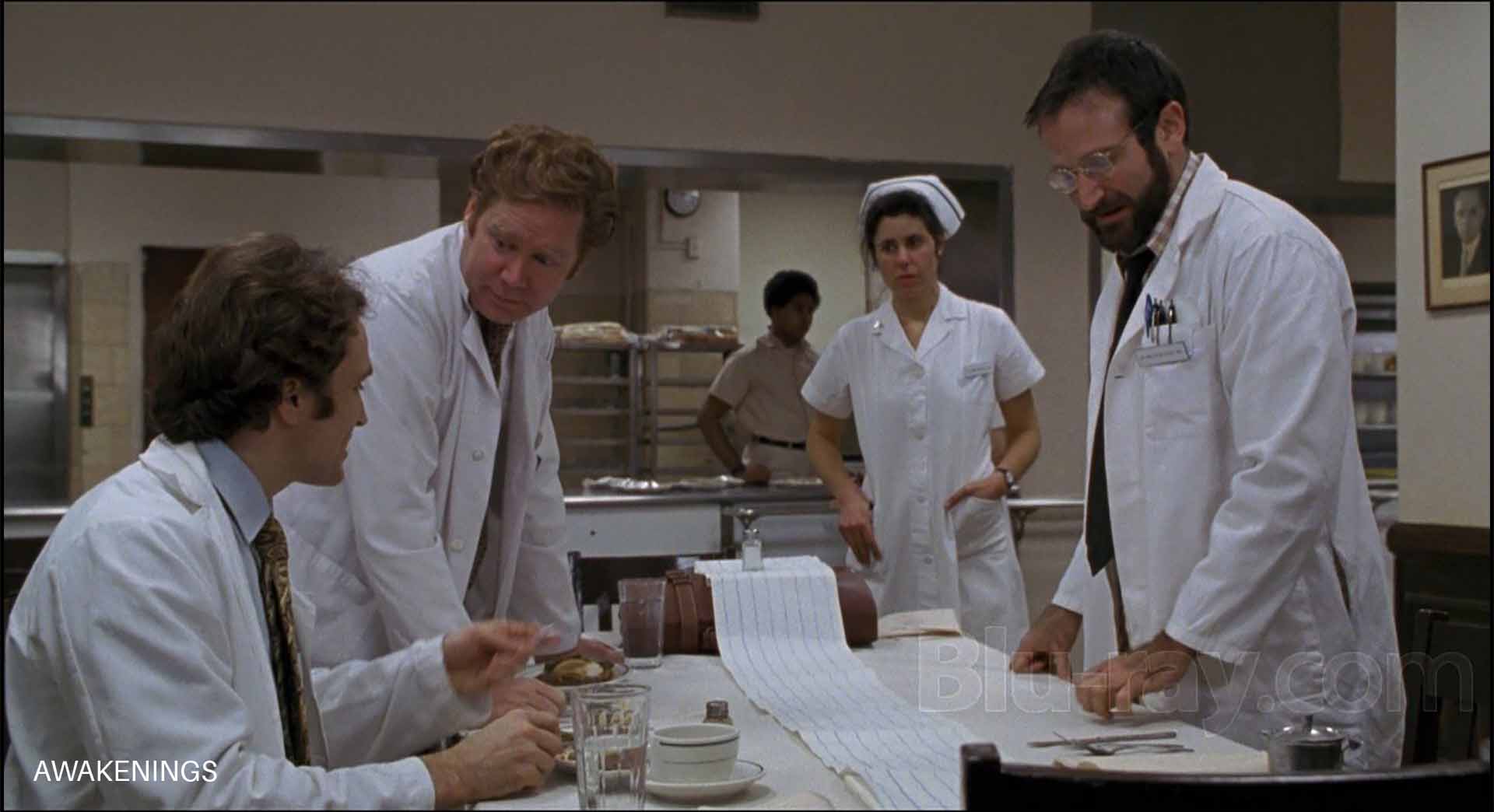
Here’s a frame from Awakenings (1991), one of the films I referenced for its film grain:
You can try to emulate the film grain characteristics of your favorite films or roll with your own. There are many techniques and plugins to apply film grain. For Gin Ke Dus, I used the in built Film Grain effect in Resolve because I was satisfied with the texture of it.
For me, that’s the key word: Texture.
How much grain texture do you like? Do you respond to it, or are you ambivalent to it? Are you doing it because you think it’s the norm, or are you really feeling something? Is it helping your movie?
I grappled with this question over months I was in the edit, and for me the answer was a clear yes: Gin Ke Dus needed Film Grain. Otherwise, I’ve never applied film grain on any earlier project. It wasn’t an easy decision to make.
Film Grain can be as simple or as complex as you want it to be. Here are some rules of thumb about film grain:
- Most cinematographers of the past tried to keep grain as minimal as possible. Companies making film stock improved the grain characteristics (which basically means making it smaller and less visible) with each film stock iteration. Contrary to popular belief, grain was not a desirable byproduct of using film stock. Talk about irony, that now most projects shot on digital cameras apply some amount of film grain!
- You won’t find any (if at all) grain in the specular highlights and deep blacks of film. The highest level of grain is in the highlights and middle tones. This contrasts with how digital images look. When you see digital noise, you typically see it in the shadows. Film is the opposite. This is not universally true (see the next point), but on the whole, you can safely follow this rule unless it’s not what you want. Rule: More Grain in the highlights, less in the middle, and even less in the shadows. No grain in the specular highlights or deep shadows. It’s a good starting point. Beyond this we’re talking nuances and taste.
- When film was underexposed and “pushed” in the lab, you would see grain in the shadows as well. Cinematographers spent decades perfecting the right amounts of film grain they wanted. Restoration of films to Blu-ray and newer DCPs might have degrained or corrected for this. You can never tell unless this information was published somewhere. Studios are notorious for making changes. If not them, the directors might have changed their tastes as years (decades) have passed. In any case, we can assume most people won’t want to emulate digital noise characteristics with film grain.
- As a general rule of thumb, the grain gets finer as the format size increases. E.g., 35mm has less grain size than 16mm film, and 8mm has the largest, because it needs to be “blown up” the most for the same screen size.
Here are some rules of thumb regarding film grain:
- Grain is usually the sharpest thing in your image.
- Grain has to be organic and unpredictable. Using the same clip again and again might introduce a pattern and that will spoil the effect.
- Grain varies depending on exposure, film stock, chemistry and even the combination of negative and print stock. I feel the better (and saner) methodology is to just try to visually emulate films that you like.
There are two additional considerations regarding film grain:
- Sometimes you’ll see white specs along with film grain. I don’t know what particular combination of factors introduces this effect, but I don’t like it.
- Heavy compression like H.264 and H.265 can really kill film grain. The algorithms in these compression technologies are not designed to reproduce film grain. The side effect is that you’ll see weird artifacts that looks ugly. So be real careful about selecting film grain for projects designed for YouTube or OTT platforms. Some of the films I’ve seen on Amazon Prime and Netflix have good film grain*, some not so much, and others really terrible. I wish I had deeper insight into why this is so inconsistent (the source matters of course, but what else?).
*Netflix and Amazon Prime Video have moved to a new compression codec called AV1 which has an interesting feature called Film Grain Synthesis. It removes film grain from the original video and sends the grain estimate “formula” to the player (in this case the Netflix app). The app/player then adds the film grain back to the video on playback, trying its best to match the original grain.
This could be the reason why film grain is preserved in a lot of films now, even with extremely heavy compression. I don’t know if I like it, because it’s not exactly what the cinematographer intended, but that’s what it is. You can see the difference in this white paper by Andrey Norkin, a research scientist at Netflix:

6 Halation
Film halation refers to the phenomenon observed with older film stocks where a halo (a kind of glow, different from Glow below) can appear around bright objects, especially against a darker background.
Here’s an example from Once Upon a Time in Hollywood:
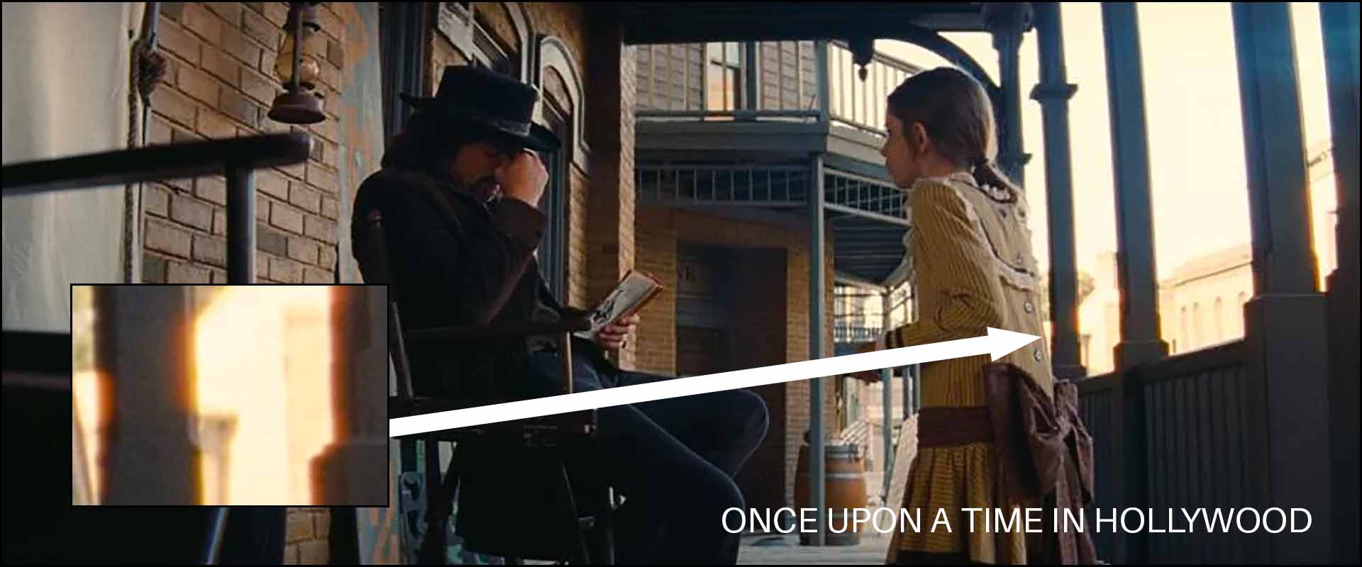
This effect is caused by the light reflected back by the film base. The reflection bleeds into adjacent layers of the film stock.
I don’t think knowing the technicalities of it helps that much in our decision-making process. What you really need to ask yourself are two questions:
- Do you like the look? Or is it a meh?
- Does it add any value at all to the story you’re telling?
If you answer the above two questions honestly, you’ll get your answer. I experimented with different halation techniques for Gin Ke Dus, and ultimately settled on the Halation effect in Resolve. It gave me what I wanted, and was organic enough to be unpredictable. I’ll explain the details later.
Halation can be considered a beautiful imperfection. But if we’re being serious here, it was (and is) mostly seen as a technical drawback. To me, this isn’t a must-have effect to emulate film.
7 Glow and Bloom
Glow typically manifests as a soft radiance encircling or over bright areas in an image, creating a dreamy, ethereal effect.
Here’s an example from Django Unchained:
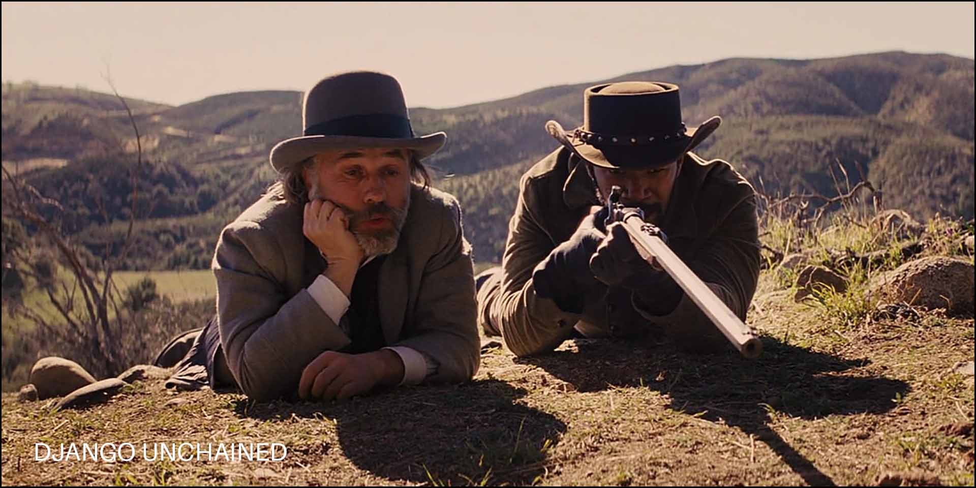
Notice the glow or bloom over the barrel or in the highlights in general.
It’s typically a result of optical imperfections in older cine lenses. You could replicate this look by using vintage cine lenses or by using special lens filters made for this purpose.
Bloom, to me, is a more obvious, opaque and intense Glow. Not always aesthetic. It appears as a broad halo or an overflow of light from the original source.
For me, Glow, when used in moderation, creates a dreamy look. You really need to back off on the effect, though. It’s easy to make your images look washed out or soft and muddy. Bloom, I hate with passion.
Is Glow a must-have effect for the film look? Not really. Some glow happens naturally with your lens choices anyway.
8 Film Gate Weave
Film gate weave is slight, often imperceptible, movement of the film as it passes through the gate (the area where the film is exposed or projected). Due to tiny inconsistencies in the mechanics the film might not be held perfectly steady, causing it to shift or “weave” up and down or side to side.
Once you see it you can’t unsee it ever again! I never saw it when I was young, and now it’s obvious. I wish I could unsee this.
Here’s the crucial question: Does gate weave impact how we perceive a movie?
To some people gate weave can give the image a lively, organic feel. I haven’t understood what that meant, because digital films shoot on cameras with great rolling shutter performance in 24 fps don’t have any issues I can think of.
Gate weave is a technical drawback. I feel it adds nothing to a film. Modern audiences are used to videos playing on different devices, specifically at higher frame rates.
9 Scratches and Dust
Scratches and dust are byproducts of not handling film stock correctly, or not storing them in a pristine environment. It is overused as an effect in many reels and social media videos. I feel it’s tacky unless you’re using it specifically to achieve a certain effect.
A good example of scratches done poorly is Death Proof:
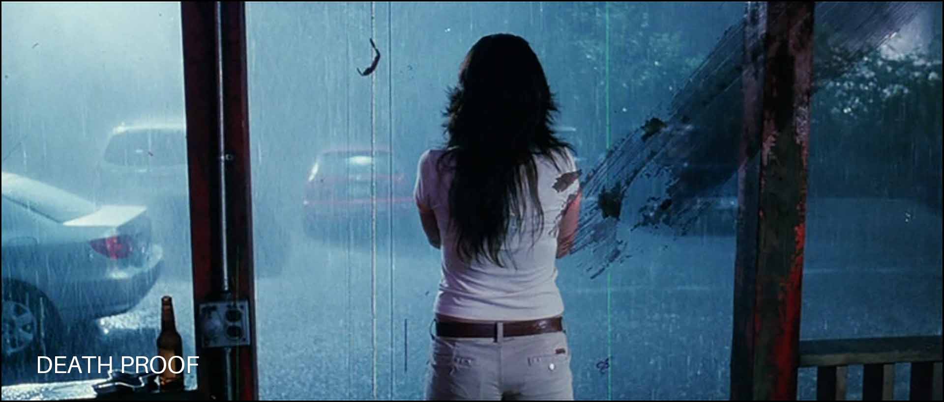
I like Death Proof, just not the scratches and dust. I thought it is totally unnecessary. I’m sure there are many who disagree. Like the other Tarantino films shown earlier, Death Proof was also shot on film, on Fuji Eterna 500T 8573 stock.
I don’t consider scratches and dust to be useful for film emulation. In fact, I would say avoid it at all costs. But you do you.
10 Noise Reduction
Noise reduction is not a part of the film workflow, but it is something you’ll most likely be doing for film emulation.
The primary reason is to get rid of noise in the shadows. The other reasons are to get rid of color noise, which is also a giveaway of a digitally shot movie.
Noise reduction has one “drawback”, it softens the image. This is especially true of Spatial noise reduction. However, this softening might help us with a slight defocusing that helps sell the film grain effect.
I think we’ve covered most of the pertinent stuff, other than some obvious ones like filming in 24 fps, maintaining a 180-degree shutter angle, etc.
A lot of this might be overwhelming to a newcomer, so I thought I’d show how I used some of these effects to clips from Moments Within. When I’m done with Gin Ke Dus, I’ll embed the trailer at the bottom of this article. As of this writing though, I can’t show any images yet since we’re still in post production. Scroll down to see the trailer.
However, I’ll be using a similar methodology. Both were shot on the same camera with a hard light strategy. You can even compare this new version with the original Moments Within with the Canon LUT.
A practical example of film emulation on my own footage on Moments Within
Let’s do this step by step. I’ll take a few shots from Moments Within and apply the following:
- Film LUT
- Noise Reduction
- Color Saturation
- Halation
- Glow
- Film Grain
I’ll explain the settings I’ve used and share the results. I’m assuming you know Davinci Resolve and these specific techniques.
Step 1. Color Space Transform
Moments Within was originally graded with the Canon Log 3 to 709 LUT that Canon provides, in Rec. 709 color space in Davinci Resolve. I didn’t use any color management because I wanted to see all the colors as Canon defined them. I like Canon colors.
However, for my movie, I graded Gin Ke Dus for a Rec.709 finish:
Project Settings:

A lot of people say the color space settings don’t matter when you pick DaVinci YRGB, but that’s incorrect. They do matter, which is why they are options in the Settings.
In this case my timeline color tools must behave according to DaVinci WG/Intermediate, and my output is strictly Rec. 709 Gamma 2.4.
It is important to tell Resolve to expect Canon Log 3 files in Full Data. This is specific to my video clips and this project.
The Color Settings Umbrella:
Here are the nodes:
- Node 1: Color Space Transform:
- Input Color Space: Canon Cinema Gamut
- Input Gamma: Canon Log 3
- Output Color Space: Davinci Wide Gamut
- Output Gamma: Davinci Intermediate
- Nodes 2 to (n-2): Color Grading Nodes (There were many nodes in between the two CST nodes, on average about 20. n is the total number of nodes)
- Node (n-1): Color Space Transform:
- Input Color Space: Davinci Wide Gamut
- Input Gamma: Davinci Intermediate
- Output Color Space: Rec. 709
- Output Gamma: Cineon Film Log (see Step 2)
Here’s a side by side of the original log image and what it looks like after this step:

Another one:

It looks a bit odd and washed out with the Cineon Log Gamma applied. Now we need to apply the LUT.
Step 2. Film LUT
I am using the Rec 709 Fujifilm 3513DI D60 as my last node, and the footage is automatically converted to Rec. 709/Gamma 2.4 with this step.
The last node is:
- Node (n): Output LUT: Rec 709 Fujifilm 3513DI D60 (it expects an input gamma of Cineon Film Log and not Rec. 709)
Here’s what it looks like after this step:

These are straight up frame grabs from Resolve, compressed down to JPEG for the web. You can see it’s certainly a look.
Step 3. Re-grading the image
When I made Moments Within initially, it was designed to show the Canon color science in all its glory. Color grading was kept to a minimum. Now that I don’t have that restriction, I made a few changes to exposure, contrast, the color balance, but nothing major. Here’s one example after grading:

Step 4. Noise Reduction
Moments Within was shot quickly over a few hours with no planning. I think we just had one or two lights, totally underpowered, but it got the job done.
However, this introduces some noise.
I use noise reduction in Resolve, both temporal and spatial. Temporal is more taxing on your system, and if used incorrectly can lead to weird artifacts. However, sometimes it works wonders. There’s no formula to it.
Spatial noise reduction is okay for most simple noise reduction, but the caveat is it softens up the image. This might not be a bad thing. If you watch movies (unsharpened digitally, hopefully) from the early nineties (or earlier), you’ll see they’re not as sharp as modern movies.
Here is an example after noise reduction:

I’ve only reduced just enough to remove the color noise in the underexposed regions. You can use the Qualifier tool to selectively reduce noise where it matters.
There’s no single setting. It has to be tweaked on a shot by shot basis for best results.
Step 5. Color Saturation
This is just two nodes in series that stays constant throughout every clip, over the entire frame:
- Node A:
- Change Color Space to HSL
- Disable Channels 1 and 3. Channel 2 is the Saturation channel.
- Reduce the Gain in the Primary Color Wheels by 50%. Start at around 0.5.
- Node B:
- Change Color Space to HSV
- Disable Channels 1 and 3. Channel 2 is the Saturation channel.
- Raise the Gain in the Primary Color Wheels by 50%. Start at around 2.
There are other ways to achieve this (subtractive color saturation) on the Internet, but this method gave me an acceptable result over the entire movie.
You can see a couple of examples of the effect below:


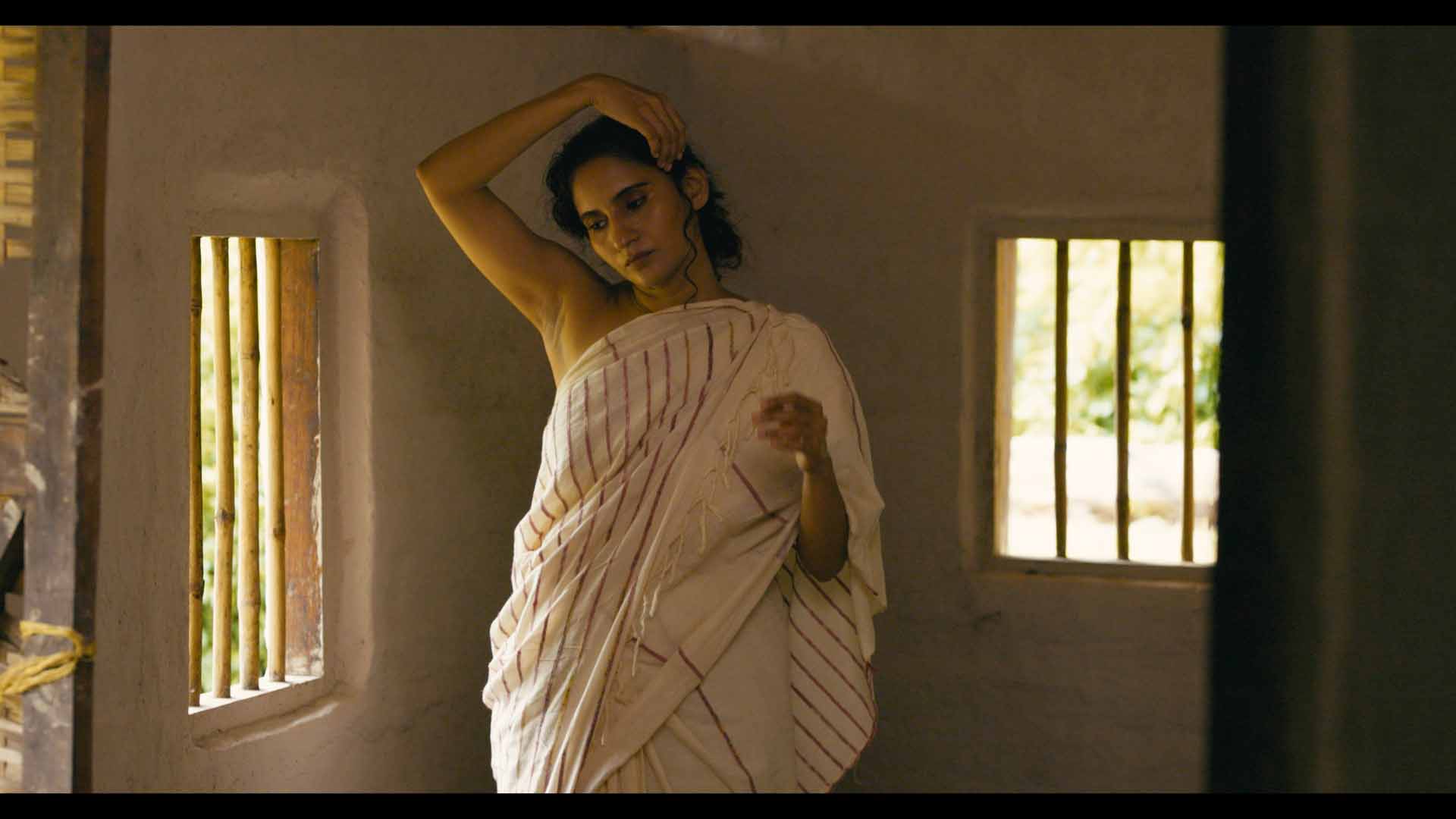
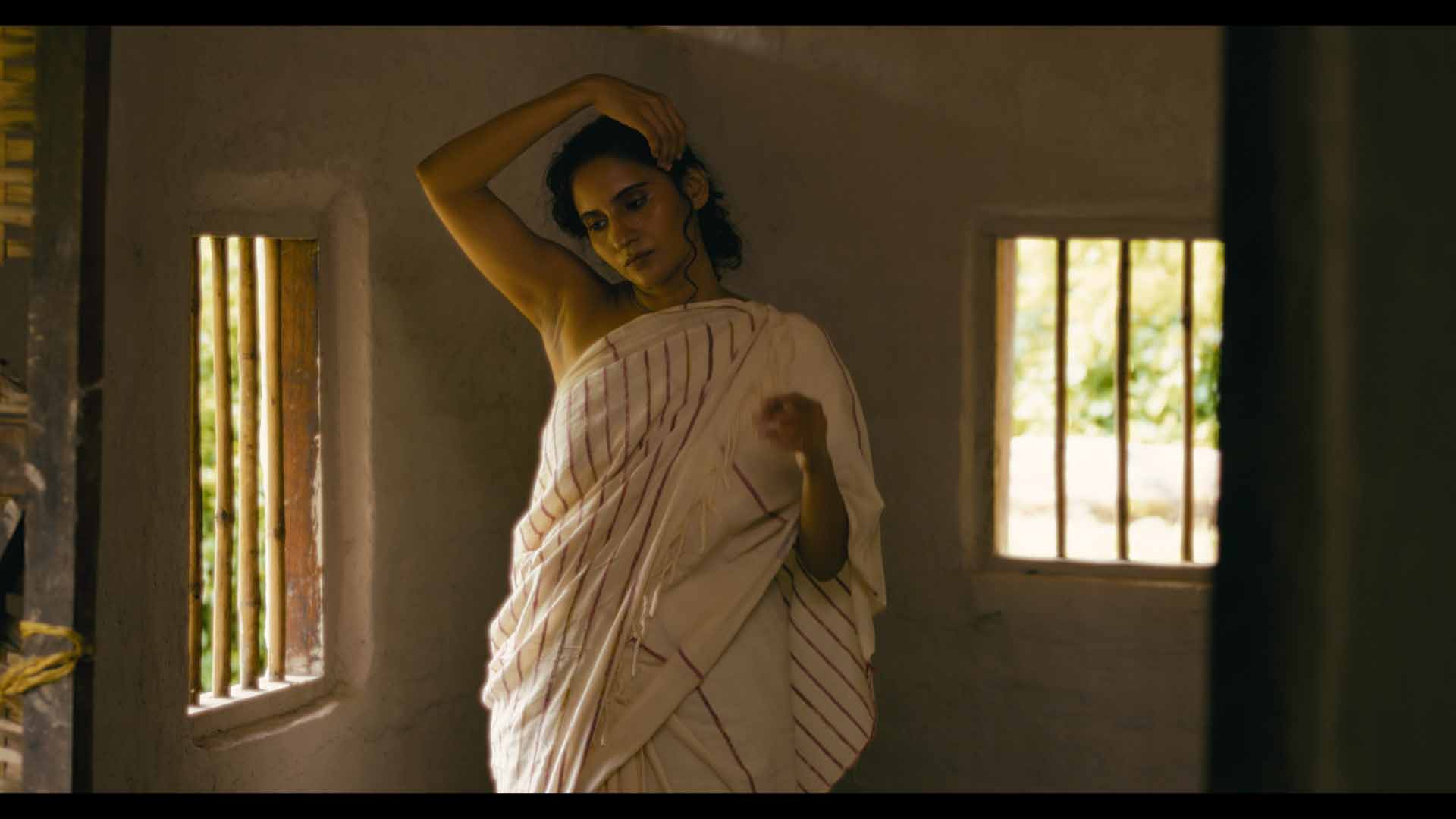
Step 6. Halation
I’m using the built-in Halation effect in Resolve, and the settings have to be tweaked to taste. I’m monitoring results on my FSI DM240 to see what I like. I don’t want to share the specific settings because I don’t want it being used as some sort of guide to Film Halation.
Here are the results:


Note: I’ve reduced the Saturation setting to 0 (zero) because I’m not a fan of orange halation (which is typical). I like it white, but you can change the color to your taste.
Notice the halation around the window bars, and her arms.
Step 7. Glow
I’m using the built in Glow effect in Resolve, and the settings have to be tweaked to taste. Again, I don’t want to share the specific settings because I don’t want it being used as some sort of guide to Glow. It’s subjective and changes from shot to shot:

By now the film has a smooth and buttery feel. I feel the skin tones look creamy. You might hate it! Feel free to let me know in the comments below.
After I’m satisfied with the entire movie as whole I move to the final step.
Step 8. Adding Film Grain
Film Grain is last because it’s taxing on the system. Depending on your GPU and computer your mileage might vary. Most of the film emulation steps involve heavy processing.
For Gin Ke Dus I researched films from 1988-1992 to study grain characteristics, and then rolled many versions in Resolve until I found what I liked.
I wasn’t looking for accuracy, I was looking for how good or bad the texture felt to me. I was expecting to like a certain grain profile, I was surprised when I picked the one I thought I’d never pick. That’s why I don’t recommend painting by numbers here.
For Moments Within, I looked for a specific set of settings that survived the Vimeo compression algorithm. Gin Ke Dus was finished for a 2K DCP, so the grain characteristics are entirely different.
This is what it looks like after Film Grain:


For this test, I used Archival 16mm Print Film Grain so the effect is more obvious. It sort of ties everything together, doesn’t it?
The final result
I didn’t spend a lot of time color grading this new version. Ideally I would spend a more more hours color grading small things to make it perfect, but this is just a test so it’s fine as is.
Here’s the final result, exported for Rec. 709/Gamma 2.4, for Vimeo:
Note: This was rendered with the default Vimeo UHD preset in DaVinci Resolve 18.5. You can see Vimeo has eaten up a lot of the grain, but there aren’t any major artifacts. It’s still visible.
Compare it with the original version embedded earlier. Which one do you prefer, and why?
Here’s the trailer to Gin Ke Dus:
I hope this article was useful to you. I’m happy to keep learning new techniques and to correct things if I’m wrong. Please share your thoughts and suggestions in the comments below and everyone can benefit.
I read somewhere that Netflix has a technique where they characterised the grain, removed it and than generated the grain live on playback. But I never really found out if this was ever implemented or only on certain devices and or hardware/software.
In my experience Apple has some of the best streaming quality with what seems to be plenty of bitrate to handle stuff like grain. And YouTube and Netflix seem the be meh… although I don’t have 4K Netflix. Might be a difference.
Great article! Very good to hammer home the point of production design. Important.
Thank you! I have 4K Netflix, though I also have other streaming platforms at 1080p where the grain is preserved on some movies but not on others.
YouTube definitely destroys grain to the point you have to go out of your way to see grain. Then it no longer represents your film and just becomes grain for grains sake.